Opportunity Identified

for the curious investor

  • Home
  • About
    • Founder’s Story
    • This Blog
    • 360 Investment Research
    • The 360 Process
    • Client First Tax and Wealth Advisors
  • Insiders Only
  • Contact Us

October 2, 2017 | Posted by David Zarling, Head of Investment Research

Invaluable Market Signal From The Value Line Geometric Index

0
0
0
0
0
0
0
0
0
0
0
0
0
0
0
0
0
0
0
0
0
0
0
0

As market participants, we should be taking a scientific approach when putting money to work, always assuming our positions are wrong and need to prove themselves. As part of that process, one piece of evidence we want to look at on a consistent basis is the health of the overall market. One such way to gauge market health is studying market breadth. In other words, how many stocks are actually participating in any directional move. That’s why we’re writing today about an index you might not be aware of but should be familiar with if you follow our research. This index is great at providing insight into the current condition of the U.S. stock market: the Value Line Geometric Index (XVG). This index tracks the median move of stocks within the index using the assumption that each stock has an equal amount (for example, $1,000) invested in them. The daily average move of this index is calculated geometrically (rather than arithmetically). If you want to geek out on the details, you can read more about this calculation here, page 4. In basic terms, the Value Line Geometric Index eliminates an illusion created by cap-weighted index components. Heavily weighted stocks within a cap-weighted index can pull it higher even as the majority of the stocks within the index are not following along. For example, in a cap-weighted index like the S&P 500, it’s possible for the top 100 weighted stocks to carry the index higher while the remaining 400 stocks lose value. As an investor, it might be helpful to identify when this is happening.

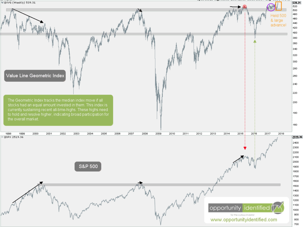
The last time we wrote about this Index, we noted it needed to hold and advance beyond the $500 level. Here’s the chart of the Value Line Geometric and S&P 500 Indexes from that post.

Value Line Geometric Index Big Picture


Here’s an updated chart comparing the popular cap-weighted S&P 500 Index with the lesser-known Value Line Geometric Index:


Value Line Geometric Index Updated

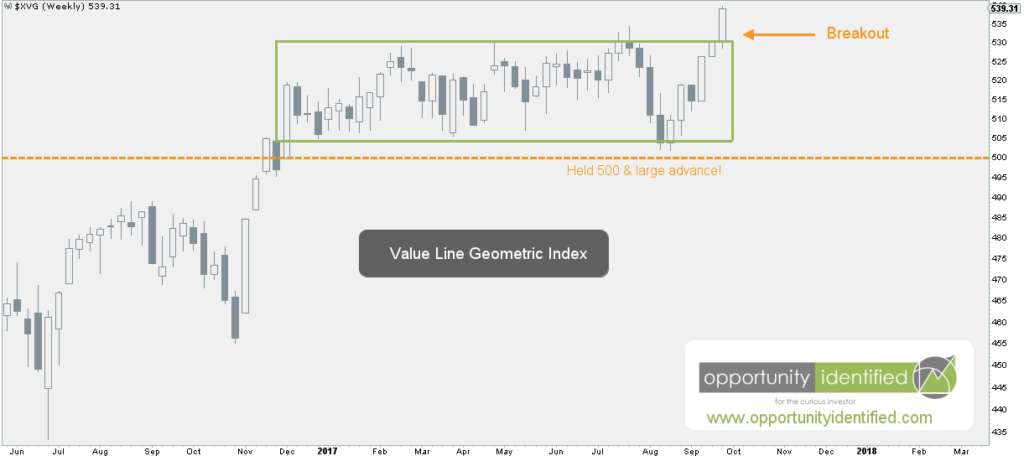
The last few weeks have been confirming evidence for our bullish market thesis. XVG held the important $500 level and advanced swiftly to all-time-highs. You read that right. This is the highest Value Line Geometric Index has been. Ever. In fact, this move is confirming a breakout of a 19-year consolidation. Note that price broke above the 1998 highs just this past December. That’s almost 20 years of going nowhere! And last week’s move was a breakout of the more recent 10-month consolidation. Check it out:

Value Line Geometric Index Up Close

From large bases come high spaces. This move is significant and is signaling broad market participation, which is not a bearish characteristic. The last time we covered this important index was back in May. Back then, large market cap stocks were leading the S&P 500 market higher. We wrote:

…we’ll want to watch for clues from the leading sector, Technology, on whether this current run can continue. It’s a positive when economic bellwethers like Apple (AAPL), Amazon (AMZN), Facebook (FB), Google (GOOGL), Nvidia (NVDA), Adobe (ADBE), Microsoft (MSFT), and Netflix (NFLX) can lead. At the same time, it would be healthy if more sectors start to participate. If and when laggards like Energy and Financials find demand, it could signal another strong leg higher for the overall market. 

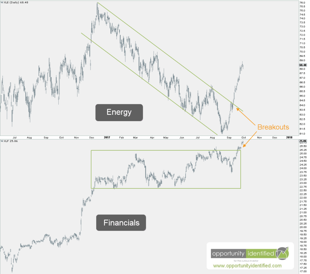
What have Energy and Financials done recently? We thought you’d never ask.

Energy and Financials Daily Charts

In conclusion, we have evidence right in front of our eyes showing broad market participation and lagging sectors getting bid. This is healthy and normal bull market behavior. We’re not saying that Energy and Financials continue to march straight upward. Trees don’t grow to the moon. But it is significant that lagging sectors are participating and the Value Line Geometric Index is breaking out. This evidence could be signaling another strong leg higher for the overall market.

As always, you can get real-time updates and commentary about this development and many more opportunities here: @360Research

AND, you’ve got FREE access to a great tool we’ve created, The Ultimate ETF Cheat Sheet. Click this link to get your FREE easy-to-use resource guide for all your ETF needs.


Disclaimer: Nothing in this article should be construed as investment advice or a solicitation to buy or sell a security. You invest based on your own decisions. Everything in this post is meant for educational and entertainment purposes only. I or my affiliates may hold positions in securities mentioned in this blog. Please see our Disclosure page for full disclaimer.

Filed Under: Breakout, Energy, Financials, Intermarket Analysis, Market Breadth, Market Outlook, Other, Participation, Pattern Recognition, S&P 500, Sector, Supply and Demand, Techniques & Tactics Tagged With: $SPX, $SPY, Market Breadth, S&P 500, SPY, Value Line Geometric Index, XVG

May 30, 2017 | Posted by David Zarling, Head of Investment Research

The Index You Never Heard Of Is Giving Important Insight

0
0
0
0
0
0
0
0
0
0
0
0
0
0
0
0
0
0
0
0
0
0
0
0

For our readers in the United States, we hope this update finds you refreshed after the long weekend and remembering those who gave their life to ensure their fellow countrymen remain free. The U.S. Markets were closed for this important observance, with trading resuming this morning. If you’re a regular reader of our work, you know it’s important to take a look at price, markets, and trends from different angles. Any edge we can gain in identifying opportunities is valuable. In this week’s post, we want to show you an important index you’ve probably never heard of that can provide valuable insights regarding the health of the U.S. stock market: the Value Line Geometric Index (XVG). This index tracks the median move of stocks within the index using the assumption that each stock has an equal amount (for example, $1,000) invested in them. The daily average move of this index is calculated geometrically (rather than arithmetically). I don’t want to bore you with the details, but if you need more info, you can read more about the methodology here, page 4. More simply put, this index eliminates an illusion created by weighted index components. Weighted stocks within an index can pull it higher even as the majority of the stocks within the index are not following along. For example, in a weighted index like the S&P 500, it’s possible for the top 100 weighted stocks to carry the index higher while the remaining 400 stocks lose value. As an investor, it might be helpful to identify when this is happening.

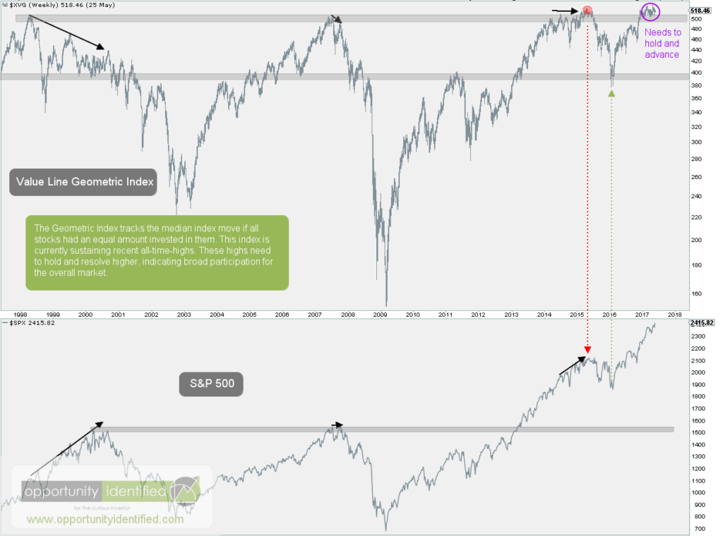
By looking at the Value Line Geometric Index alongside the S&P 500, we gain valuable insight into what is currently taking place in the market. Looking at the chart below, the Value Line Geometric Index is in the upper panel and the S&P 500 in the lower.

Value Line Geometric Index Big Picture

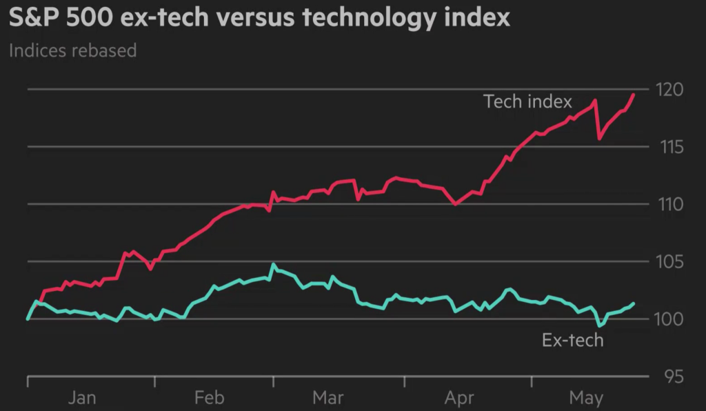
Notice the equal-weighted Value Line index is holding steady above the highs of 1998, 2007, and 2015 while the S&P 500 has continued higher (divergence). This condition has been persistent since December 2016. This means the market is thin: money is flowing into large cap stocks and leaving the rest behind. This is a stock picker’s market and can be a hallmark of market tops, but is not a guarantee a price correction is upon us. It should be noted when looking at the chart above that this condition can persist for quite a while before there is an overall resolution to the market (aka a correction in price). In the past, a noticeable divergence developed between the Value Line Geometric Index and the cap-weighted S&P 500 before the S&P 500 corrected in price. This doesn’t mean the S&P will correct in price right now or at all. But, it does mean that it is getting harder to find U.S. stocks that are trending up. If the majority of U.S. stocks are flat or down, what stocks are carrying the market higher? Awesome question. Let’s take a look at the data. Here’s a great visual from Financial Times using data from Bloomberg:

S&P 500 ex Technology

This chart shows while most stocks within the S&P 500 have been flat, it’s Technology pulling this major index higher. Many assume when the S&P 500 records new highs, it means everything under the surface is participating. This couldn’t be further from the truth. In fact, many sectors are currently underperforming the overall index. Because of tech’s large weighting (over 20%) in the S&P 500, it’s been carrying the water for other sectors currently struggling to gain traction for the past few months.

While the condition persists, market participants will need to be diligent in their stock selection. In addition, we’ll want to watch for clues from the leading sector, Technology, on whether this current run can continue. It’s a positive when economic bellwethers like Apple (AAPL), Amazon (AMZN), Facebook (FB), Google (GOOGL), Nvidia (NVDA), Adobe (ADBE), Microsoft (MSFT), and Netflix (NFLX) can lead. At the same time, it would be healthy if more sectors start to participate. If and when laggards like Energy and Financials find demand, it could signal another strong leg higher for the overall market. But if Technology start to sell off and the Value Line Geometric Index fails to hold these recent highs, it likely means a decent correction will be underway. As always, we don’t need to predict to invest. Price is the only fact that matters. And as long as this condition is in place, we’ll be watching the price of the S&P 500 closely. You should be too.

As always, you can get real-time updates and commentary about this development and many more opportunities here: @360Research

AND, you’ve got FREE access to a time-saving tool we’ve created, The Ultimate ETF Cheat Sheet. Click this link to get your FREE easy-to-use resource guide for all your ETF needs.


Disclaimer: Nothing in this article should be construed as investment advice or a solicitation to buy or sell a security. You invest based on your own decisions. Everything in this post is meant for educational and entertainment purposes only. I or my affiliates may hold positions in securities mentioned in this blog. Please see our Disclosure page for full disclaimer.
Filed Under: Energy, Equity, Financials, Market Breadth, Market Environment & Structure, Market Outlook, Participation, S&P 500, Sector, Technology Tagged With: $SPX, $SPY, Energy, Financials, S&P 500, Technology, Value Line Geometric Index, XVG

April 15, 2016 | Posted by David Zarling, Head of Investment Research

Market Awaits Banking Sector’s Next Move

0
0
0
0
0
0
0
0
0
0
0
0
0
0
0
0
0
0
0
0
0
0
0
0

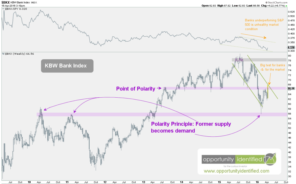
When the banking sector performs well, it’s a healthy characteristic for the overall equity market. When the banking sector performs poorly, it’s no surprise to see overall stocks perform the same. Case in point, when banking stocks rolled over in Summer, 2015, so did the overall market. Don’t take our word for it. Check out the weekly chart of the KBW Bank Index below. The KBW Bank Index (BKX) is a modified market capitalization weighted index designed to track the performance of leading banks that are publicly traded in the U.S. We can’t trade it directly, but it’s a great index to monitor and identify what’s going on within the economically important banking sector.

In the weekly chart below, we can see that banks topped at the same time (mid-July, 2015) as the overall U.S. equity market. Is this a surprise? We think not. And since the top in 2015, the banking industry has struggled, taking the U.S. stock market with it. If this is not a surprise, then the fact that banks have rallied since early February along with U.S. stocks should also not be a surprise. Which brings us to today. We think the current price level will determine the next move for the overall equity market.

We can see that the BKX has rallied up into the very important $66-67 price level. This price level is important based on the principle of polarity, which simply means that once an area of demand is broken, that same level becomes an area of supply (and vice versa). We can see this principle in action in the chart below. Notice in 2010 and 2011, sellers showed up in the area of $55-56, driving prices downward. This area of supply was overcome in early 2013. Low and behold, during the most recent sell0ff, buyers stepped in at that same level over three years later. Investor memory and psychology are real forces within the marketplace.

KBW Bank Index Chart - Banking Sector - Weekly

Under those same forces, we find BKX up against another point of polarity. For over a year, the $66-67 level is where buyers provided demand for this important sector. This level was broken in late 2015 and is now expected to be an area of supply that must be overcome for the overall market to continue upward.

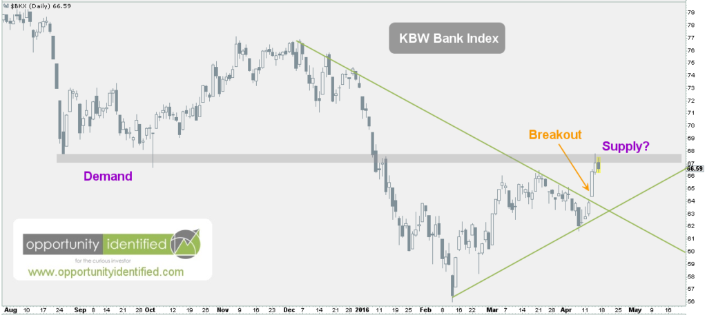
Here’s the daily chart. We can see the breakout from three days ago. We can also see that price is right up against the point of polarity at $66-67. What happens next is extremely important in signaling the next move for U.S. equities.

KBW Bank Index Chart - Banking Sector - Daily

If buyers can drive BKX over $66-67 and sustain above it, that bodes well for the prospects of U.S. stocks in general. If there are more sellers than buyers right here, causing price to fall towards new demand, then we can expect renewed weakness within the overall U.S. stock market.

Keep an eye on this one.


Disclaimer: Nothing in this article should be construed as investment advice or a solicitation to buy or sell a security. You invest based on your own decisions.

Filed Under: Education, Equity, Financials, Market Outlook, Psychology, Sector, Supply and Demand Tagged With: $$BKPIX, $BANK, $BIX, $BKX, $DJSRBK, $DJUSBK

November 20, 2014 | Posted by David Zarling, Head of Investment Research

Leader of the Pack [Weight of Evidence, Part 5 of 7]

0
0
0
0
0
0
0
0
0
0
0
0
0
0
0
0
0
0
0
0
0
0
0
0

Weight of Evidence: Part 1 | Part 2 | Part 3 | Part 4 | Part 5 | Part 6 | Part 7

At 360 Investment Research, we like to dig deep into the market and take a look at what sectors are leading the US market upward. By analyzing sectors on a relative basis against the S&P 500, we can gain insight into what sectors are leading the charge. This, in turn, may provide clues on where we are in the market/economic cycle. The theoretical market/economic cycle is a model based on the work of Sam Stovall in his book, S&P’s Guide to Sector Rotation. The basic premise is that different sectors are stronger at different points in the economic cycle. StockCharts.com has done a great job elaborating on this rotational cycle. The chart below is courtesy of StockCharts.com. It does a good job of visualizing these relationships and the order in which each sector should outperform in the context of the overall market. Moving from left to right, we see that Cyclicals (or Consumer Discretionary) and Technology lead the market out of bottoms. Industrials, Basic Materials, and Energy lead during a Bull Market. And Staples, Healthcare, Utilities, and Finance are the safe havens during Bear Markets. It’s not as clear cut as what I just wrote or what is visualized below, but it is a really great guide to the likely relative performance characteristics of each sector as the market progresses.

Sector Rotation Model - Stockcharts

Researching approximately how each sector is performing can be a good exercise in determining where we might be in the overall market cycle. Obviously, if we’re in a healthy Bull Market, we want to see Bull Market leaders like Technology, Industrials, Materials and Energy outperforming (or leading) the overall market. Conversely, we would be concerned about the overall prospects of the market and economy if we see that big money is moving into defensive sectors like Staples, Healthcare, and Utilities. So let’s dig in and see what sectors are leading the overall market.

One of the best ways of observing which sectors are doing the best and which sectors are lagging is through the use of Relative Rotation Graphs (RRG) [1]. RRG charts show us the relative strength and momentum for a group of stocks or ETFs. These stocks or ETFs are compared against a benchmark. In our case, we’re going to compare the aforementioned sectors using the overall market (the S&P 500) as our benchmark. That is to say, the performance of each of these sectors will be compared against the performance of the S&P 500. If a sector is outperforming the market, they are said to be the leaders. If a sector is underperforming the market, they are the laggards. On the RRG chart below, the following ETFs are being used as proxies for each sector:

  • XLY (Cyclicals or Consumer Discretionary)
  • XLK (Technology)
  • XLI (Industrials)
  • XLB (Materials)
  • XLE (Energy)
  • XLP (Staples)
  • XLV (Health Care)
  • XLU (Utilities)
  • XLF (Financials)

Of the ETFs above, those with strong relative strength and momentum in comparison to the S&P 500 appear in the green Leading quadrant. Those with relative momentum fading move into the yellow Weakening quadrant. If relative strength then fades, they move into the red Lagging quadrant. And when momentum starts to pick up again, they shift into the blue Improving quadrant. In the RRG below, the long tails represent the movement of each sector over the past 20 weeks in comparison to the S&P 500. So what do we see? We see that  XLV, XLU, XLP, and XLF have moved from positions of weakness and laggards to positions of leadership. Health Care (XLV), Utilities (XLU), Staples (XLP), and Financials (XLF) – defensive sectors – are leading this market. On the other hand, Technology (XLK) is weakening while Energy (XLE), Materials (XLB), and Cyclicals (XLY) are lagging. Bluntly, defensive stocks are leading and those who we want to lead a Bull Market are lagging. Money is flowing into defensive sectors. This is not what a healthy and powerful Bull Market looks like. Does it mean that this the top of the Bull Market? No one knows that. But, enough money is flowing into defensive sectors that investors like you and me should take notice.

[1]  Note: The terms “Relative Rotation Graph” and “RRG” are registered trademarks of RRG Research.

11-21-2014 Leader of the Pack RRG [weight of evidence, 5 of 7]

Weight of Evidence: Part 1 | Part 2 | Part 3 | Part 4 | Part 5 | Part 6 | Part 7

Filed Under: Consumer Discretionary, Consumer Staples, Energy, Equity, ETF, Financials, Health Care, Industrials, Materials, Relative Strength Analysis, Rotational Regression Graphs, Sector, Sector Rotation, Techniques & Tactics, Technology, Utilities Tagged With: $SPX, $XLB, $XLE, $XLF, $XLI, $XLK, $XLP, $XLU, $XLV, $XLY, Consumer Discretionary, Defensive stocks, Economic Cycle, Energy, Financials, Health Care, Industrials, Laggards, Leaders, Market Cycle, Materials, Relative Rotation Graph, RRG, RRG Research, S&P 500, S&P's Guide to Sector Rotation, Sam Stovall, Sector Rotation, Sectors, Staples, Stockcharts.com, Technology, Utilities

Find Out Our Top 10 Questions to Ask Your Financial Adivsor!

Subscribe to our mailing list today. No spam - we promise!

* indicates required
Tweets by @@360Research

Recent Posts

  • How To Get Involved In The Drug Trade (It’s Not What You Think!)
  • Invaluable Market Signal From The Value Line Geometric Index
  • This Is How To Navigate Amazon
  • Get Intel Inside Your Portfolio
  • Simple Market Secret: Just Look Left

Tags

$DBO $ES_F $INDU $SH $SPX $SPXA200 $SPY $TNX $USD $USO $UUP $VIX $WTIC $XLP $XLV Ascending Triangle Bonds Bottom breakout Confluence Consolidation Cycles demand descending triagle divergence Dow Jones Energy measured move Price Resistance risk/reward risk management RSX Russia RUT S&P 500 S&P500 SPY Supply TLT Trend Change trendline US Dollar Volatility weight of evidence

Copyright 360 Investment Research, LLC - All rights reserved © 2023