Opportunity Identified

for the curious investor

  • Home
  • About
    • Founder’s Story
    • This Blog
    • 360 Investment Research
    • The 360 Process
    • Client First Tax and Wealth Advisors
  • Insiders Only
  • Contact Us

October 2, 2017 | Posted by David Zarling, Head of Investment Research

Invaluable Market Signal From The Value Line Geometric Index

0
0
0
0
0
0
0
0
0
0
0
0
0
0
0
0
0
0
0
0
0
0
0
0

As market participants, we should be taking a scientific approach when putting money to work, always assuming our positions are wrong and need to prove themselves. As part of that process, one piece of evidence we want to look at on a consistent basis is the health of the overall market. One such way to gauge market health is studying market breadth. In other words, how many stocks are actually participating in any directional move. That’s why we’re writing today about an index you might not be aware of but should be familiar with if you follow our research. This index is great at providing insight into the current condition of the U.S. stock market: the Value Line Geometric Index (XVG). This index tracks the median move of stocks within the index using the assumption that each stock has an equal amount (for example, $1,000) invested in them. The daily average move of this index is calculated geometrically (rather than arithmetically). If you want to geek out on the details, you can read more about this calculation here, page 4. In basic terms, the Value Line Geometric Index eliminates an illusion created by cap-weighted index components. Heavily weighted stocks within a cap-weighted index can pull it higher even as the majority of the stocks within the index are not following along. For example, in a cap-weighted index like the S&P 500, it’s possible for the top 100 weighted stocks to carry the index higher while the remaining 400 stocks lose value. As an investor, it might be helpful to identify when this is happening.

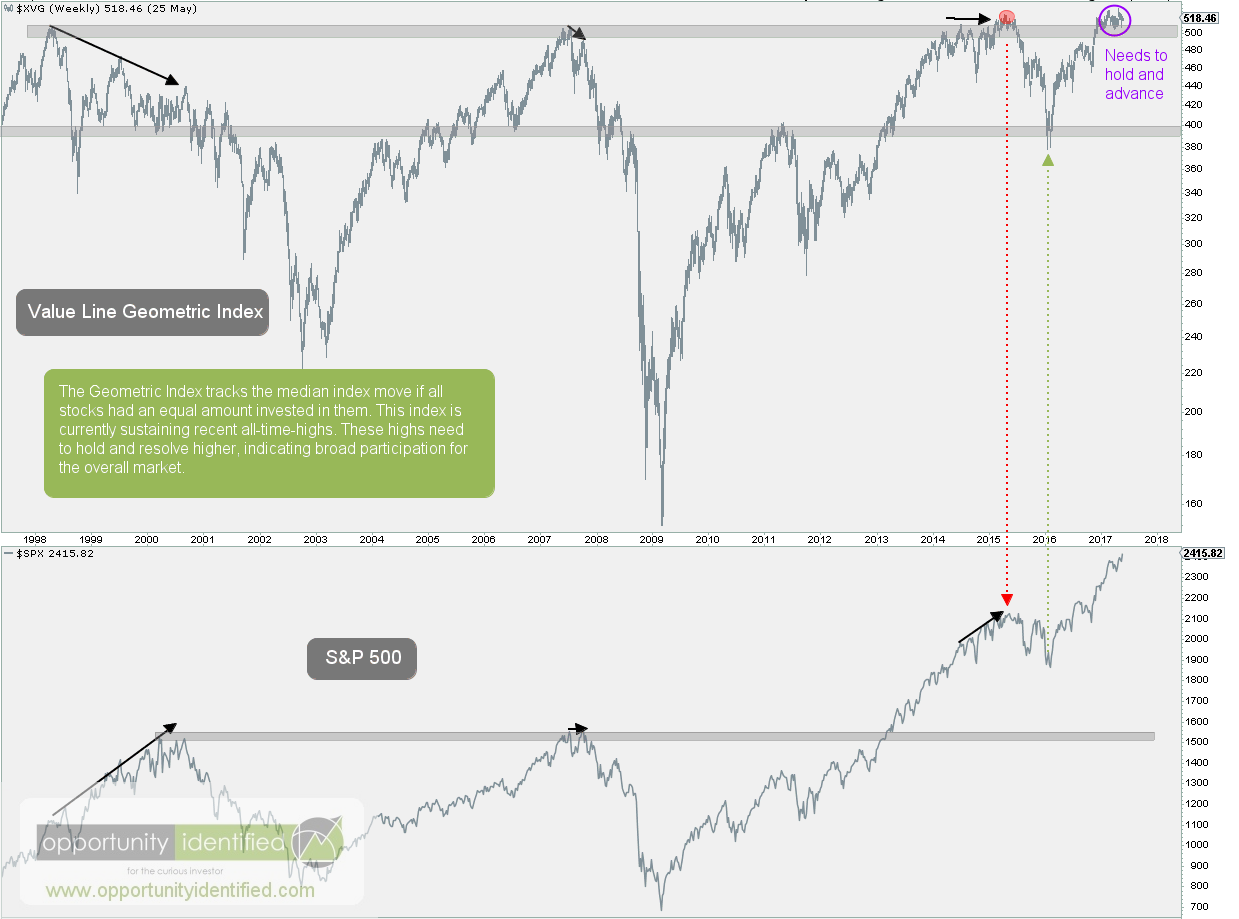
The last time we wrote about this Index, we noted it needed to hold and advance beyond the $500 level. Here’s the chart of the Value Line Geometric and S&P 500 Indexes from that post.

Value Line Geometric Index Big Picture


Here’s an updated chart comparing the popular cap-weighted S&P 500 Index with the lesser-known Value Line Geometric Index:


Value Line Geometric Index Updated

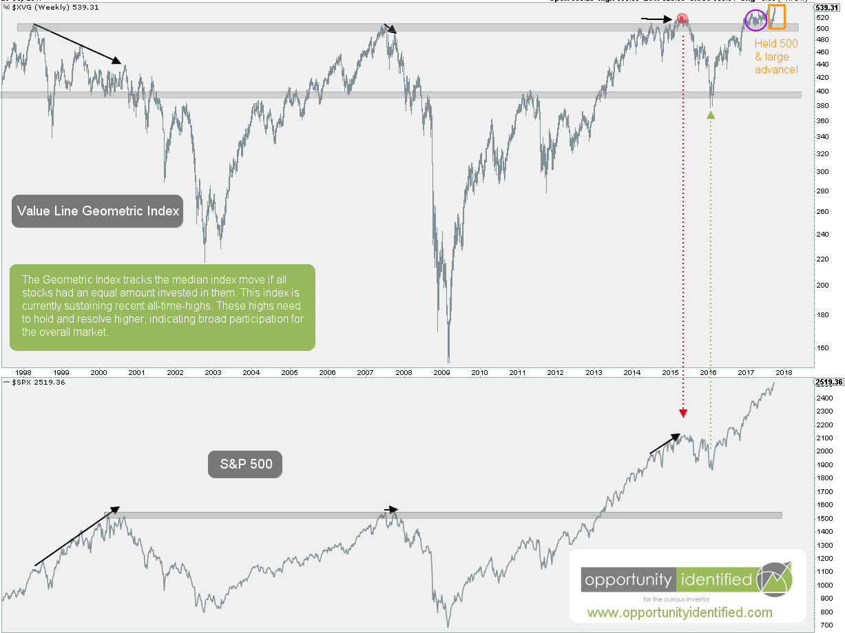
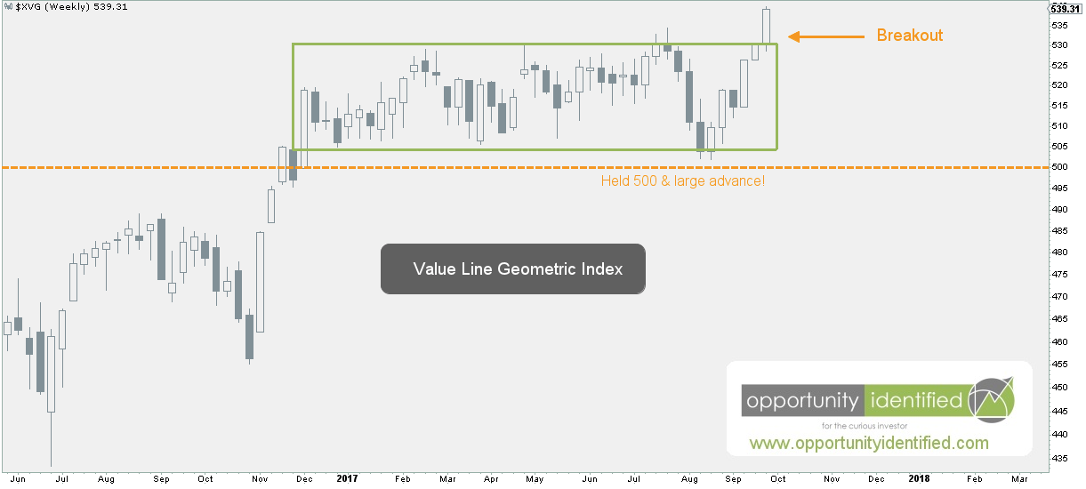
The last few weeks have been confirming evidence for our bullish market thesis. XVG held the important $500 level and advanced swiftly to all-time-highs. You read that right. This is the highest Value Line Geometric Index has been. Ever. In fact, this move is confirming a breakout of a 19-year consolidation. Note that price broke above the 1998 highs just this past December. That’s almost 20 years of going nowhere! And last week’s move was a breakout of the more recent 10-month consolidation. Check it out:

Value Line Geometric Index Up Close

From large bases come high spaces. This move is significant and is signaling broad market participation, which is not a bearish characteristic. The last time we covered this important index was back in May. Back then, large market cap stocks were leading the S&P 500 market higher. We wrote:

…we’ll want to watch for clues from the leading sector, Technology, on whether this current run can continue. It’s a positive when economic bellwethers like Apple (AAPL), Amazon (AMZN), Facebook (FB), Google (GOOGL), Nvidia (NVDA), Adobe (ADBE), Microsoft (MSFT), and Netflix (NFLX) can lead. At the same time, it would be healthy if more sectors start to participate. If and when laggards like Energy and Financials find demand, it could signal another strong leg higher for the overall market. 

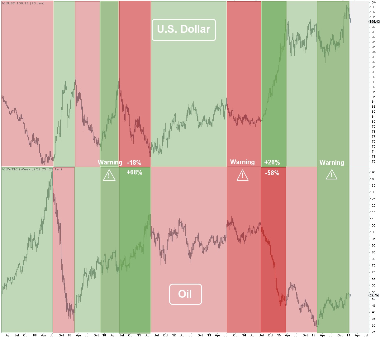
What have Energy and Financials done recently? We thought you’d never ask.

Energy and Financials Daily Charts

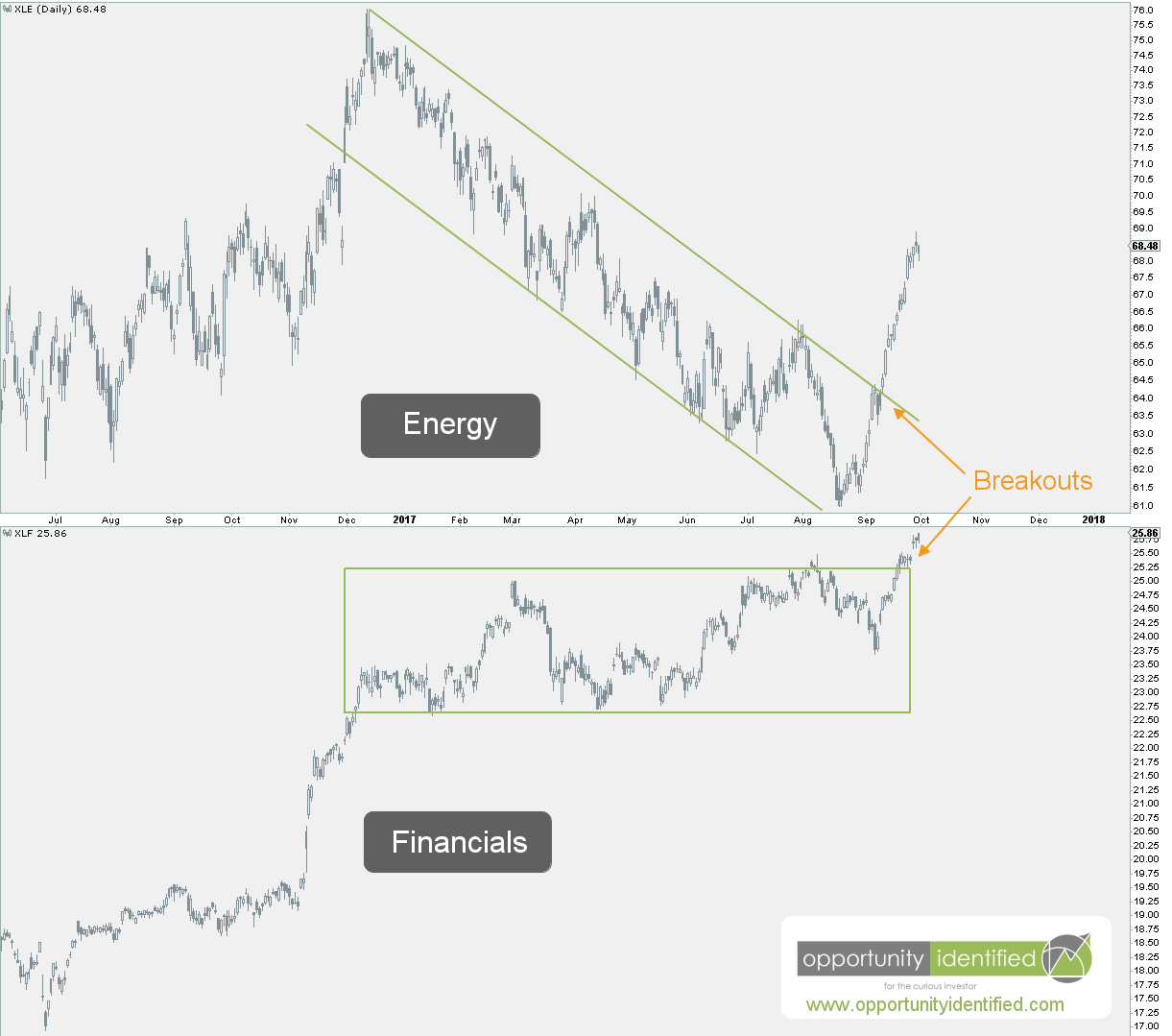
In conclusion, we have evidence right in front of our eyes showing broad market participation and lagging sectors getting bid. This is healthy and normal bull market behavior. We’re not saying that Energy and Financials continue to march straight upward. Trees don’t grow to the moon. But it is significant that lagging sectors are participating and the Value Line Geometric Index is breaking out. This evidence could be signaling another strong leg higher for the overall market.

As always, you can get real-time updates and commentary about this development and many more opportunities here: @360Research

AND, you’ve got FREE access to a great tool we’ve created, The Ultimate ETF Cheat Sheet. Click this link to get your FREE easy-to-use resource guide for all your ETF needs.


Disclaimer: Nothing in this article should be construed as investment advice or a solicitation to buy or sell a security. You invest based on your own decisions. Everything in this post is meant for educational and entertainment purposes only. I or my affiliates may hold positions in securities mentioned in this blog. Please see our Disclosure page for full disclaimer.

Filed Under: Breakout, Energy, Financials, Intermarket Analysis, Market Breadth, Market Outlook, Other, Participation, Pattern Recognition, S&P 500, Sector, Supply and Demand, Techniques & Tactics Tagged With: $SPX, $SPY, Market Breadth, S&P 500, SPY, Value Line Geometric Index, XVG

April 10, 2017 | Posted by David Zarling, Head of Investment Research

This Is How The Relationship Between Lumber And Gold Will Impact Your Portfolio

0
0
0
0
0
0
0
0
0
0
0
0
0
0
0
0
0
0
0
0
0
0
0
0

Many investors tend to focus on asset-class specific study to gain an edge. They attempt to obtain outperformance based on factors directly related to the asset class being studied. This is an appropriate practice and can provide valuable insight. But in this post, similar to last week’s article on the relationship between Copper and Latin American equities, we’re going to look at the relationship between Lumber and Gold. Specifically, we’re going to follow-up on previous research showing the relationship between Lumber and Gold contain insights into risk-seeking and risk-averse behavior in stocks. The Lumber/Gold relationship is not a novel idea. This important connection was brought to the fore by Charlie Bilello and Michael Gayed in their 2015 NAAIM Wagner Award Winning Paper, “Lumber: Worth Its Weight In Gold.” Charlie and Michael are extremely smart asset managers with strong thought leadership when it comes to actively managing funds. We can’t hold their intellectual jocks, but we can use their research and look into the current state of Lumber and Gold to find another piece of evidence for managing risk in today’s market. In their research, they find:

As Lumber outperforms Gold, equities tend to exhibit an upward bias and have lower volatility. These are conditions that are conducive towards maintaining higher exposure to risk assets. As Gold outperforms Lumber, the opposite tends to be true, whereby the inclusion of lower beta assets in a portfolio increases overall return and lowers volatility at the time it is needed most. The relationship between Lumber and Gold helps to answer the most critical question for active asset managers: when to take more risk (“play offense”) and when to take less risk (“play defense”) in an investment portfolio – before it’s too late.

The relationship between Gold and Lumber can give us valuable insight into U.S. stock market volatility and risk. As market participants, we can use this relationship to give us an edge. Simply put, their findings highlight when Lumber is outperforming Gold, it is a risk-on (offensive) characteristic for stocks. In this scenario, investors can be more aggressive with their equity exposure. Oppositely, when Gold is outperforming Lumber, this is risk-off (defensive) behavior and investors should take a more protective stance. Accordingly, it makes sense for us to dig into how Lumber and Gold are performing and conclude with a review of their relative strength to each other.

Here’s the weekly chart of Gold:

Gold Weekly Chart

Gold remains in a downtrend from weekly perspective. Since 2011, everyone’s favorite precious metal has been making lower highs and lower lows, the very definition of a downtrend. That is, until recently. In early 2017, Gold locked in a higher lower. This was a productive step towards trend change. If it can break through the upper green trend line, we’ll have a break in trend momentum. A close above $1,375 would establish a higher high and a potential new uptrend underway. For now, it remains within compression (two converging trendlines). Out of this compression will come a move that most likely will determine Gold’s future in the weeks and months ahead.

As for Lumber, here’s its respective weekly chart:

Lumber Weekly Chart

Lumber broke out of a downtrend in early 2016. In fact, Lumber’s higher low in February 2016 coincided with a bottom in U.S. stocks. Never discount coincidence. Since then, Lumber has continued to establish higher highs and higher lows in price. Just last week, it broke from a month’s long consolidation to make an attempt at the early 2013 highs. A break above the $400 level would be extremely productive for Lumber overall.

Now, here’s what you’ve been waiting for. The weekly chart of Lumber : Gold. As a friendly reminder, when Lumber is outperforming Gold, the ratio rises. When Gold is outperforming Lumber, the ratio falls.

Lumber:Gold Weekly Chart

Even going back to 2011, we can see the ratio bottom in August of that same year. Do you know what also bottomed at the very same time? The S&P 500. The ratio broke out of a long-term downtrend in late 2012, which preceded the S&P 500 breaking to fresh all-time-highs in August 2013. Similarly, this important ratio broke down in late 2014, which preceded an S&P 500 breakdown in July 2015. More recently, we’ve seen Lumber outperform Gold and establish a higher low in February 2016 and breakout of an intermediate downtrend in November 2016. Since then, the ratio has been continuing its movement upwards signaling risk-on behavior in stocks and diminishing volatility overall. We’ve definitely seen stocks take off since then and volatility crushed with one of the calmest markets in history during this time frame. Just last week, as Lumber broke towards its 2013 highs, this ratio also broke out to a level not seen in eight years.

The next few weeks will be crucial for this relationship and the significance it carries for equities overall. Lumber needs to break through the $400 level in order to ratio to hold onto its recent breakout. If Lumber : Gold can hold onto these recent highs, it will likely mean further upside for equities (especially high beta equities) and suppression of volatility. On the flip side, if Lumber falters here while Gold continues to move upward, the ratio will roll over, signaling a need to take a defensive stance in your portfolio.

As always, you can get real-time updates and commentary about this development and many more opportunities here: @360Research

AND, you’ve got FREE access to an investing tool we’ve created, The Ultimate ETF Cheat Sheet. It’s an easy-to-use resource guide.


Disclaimer: Nothing in this article should be construed as investment advice or a solicitation to buy or sell a security. You invest based on your own decisions. Everything in this post is meant for educational and entertainment purposes only. I or my affiliates may hold positions in securities mentioned in this blog. Please see our Disclosure page for full disclaimer.

Filed Under: Breakdown, Commodity, Equity, Gold, Intermarket Analysis, Lumber, Market Outlook, Precious Metals, Ratio Analysis, Risk Management, S&P 500, Soft Commodity, Volatility Tagged With: $CUT, $GC_F, $GLD, $GOLD, $LS_F, $LUMBER, $SPX, $SPY, $WOOD

April 3, 2017 | Posted by David Zarling, Head of Investment Research

Use This Secret Key To Unlock Latin America

0
0
0
0
0
0
0
0
0
0
0
0
0
0
0
0
0
0
0
0
0
0
0
0

At 360 Investment Research, we take a top-down, weight-of-evidence approach to markets. One key feature of this method is looking at relationships across asset classes to identify opportunities and manage risk. This intermarket analysis allows us to gain a big picture perspective of demand and supply in markets across the globe. After all, this is 2017, we have access to markets and investment vehicles our parents only dreamed of. With a click of a button, we can own commodities, currencies, sectors, industries, regional markets, you name it. Never before have individual investors had so much available to them for gaining investment knowledge, finding great investment opportunities, and the ability to take advantage of them at such a low cost. With the advent of ETFs, common investors can invest in pretty much whatever they want. Want to buy timber? Go for it. There’s an ETF for that (CUT). Is that ETF ticker not clever enough? Try WOOD. How about palladium? Got you covered (PALL). Want to invest in foreign markets like South Korea? Be my guest (EWY). Need it currency hedged. Got that too (HEWY). Do you really like coffee? Try JO. With sugar? Sure! (SGG). Before we get too carried away, investors also need to understand that ETFs are not a holy grail for accessing certain investment themes. In the words of investing legend, Peter Lynch, “Know what you own, and know why you own it.” The “why we own it” is easy: we’re here to make money. It’s the first part of the equation that can be a bit tricky. “Know what you own.” Investors need to understand that ETFs are notorious for tracking difference and tracking error. If you want to get into the minutiae, you can read up on those here. And since this article is focusing on a commodity, you should read this piece to understand the effects of contango and backwardation on commodity ETFs. Even with the aforementioned limitations, we can use ETFs to our advantage. Now, let’s dig into the main focus of this article, the secret key to unlocking Latin America: Copper

First, we need to acknowledge the weakness in Latin American stocks from April 2011 – January 2016. For five years, Latin America was a hot mess. Using the ETF for Latin America (ILF) as our proxy, we can witness this classic downtrend first hand.

Latin America ILF Weekly Chart

While U.S. equities were rallying, Latin American equities were getting crushed. Not until early 2016, did the trend of lower highs and lower lows reverse into a series of higher highs and higher lows. Recently, demand has pushed Latin American prices to levels not seen since 2015. Not only did ILF breakout on an absolute basis, it accomplished the same on a relative basis to U.S. stocks. Take a look.

Latin America v S&P 500 Weekly

Since the beginning of 2016, Latin America via ILF has been outperforming the United States via SPY (proxy for S&P 500). This is an important development and as long as Latin America continues to make higher highs and higher lows above a 40-week simple moving average on both an absolute and relative basis, it makes sense to own Latin American stocks.

What does Copper have to do with all of this? Awesome question. There are 19,100,000 metric tonnes of Copper mined each year. Two of the top three, and four of the top 15, producers of Copper are within the Latin American region: Chile, Peru, Mexico, Brazil. Roughly 40% of the world’s Copper originates from the four aforementioned countries. [1] It would make sense that if the demand for Copper increased, it could bode well for these important players in LatAm. The opposite would also apply. Here’s the weekly chart of Copper using JJC, which tries to track the Bloomberg Copper Subindex Total Return. It’s not a perfect instrument, as we previously highlighted, but it’s good enough for our analysis here.

Copper JJC Weekly Chart

Look somewhat familiar? It should. The visualization of supply and demand (aka chart) looks very similar to that of Latin America. To make it easy on you, here’s the weekly chart of Copper placed directly over the same timeframe for Latin America.

Copper and Latin America Weekly Charts Related

It’s quickly apparent there is a strong relationship between the supply and demand for Copper and the supply and demand for Latin American Equities. They are not 100% correlated, but the tops and bottoms (aka changes in supply and demand) mirror each other. It’s not clear whether one asset class leads the other. At a minimum, however, they’re significantly coincident. Never discount coincidence. By studying the price of one, we can gather insight into the price of the other. If we’re long Latin American equities, it makes sense to pay close attention to Copper as well. And if Copper were to breakdown from its recent consolidation, it wouldn’t make much sense to have a long position in Latin American equities.

Copper JJC Daily Chart

Since the large move in November of last year, Copper has been consolidating its gains. This can be productive. However, if Copper were to breakdown from this consolidation, the message of supply and demand would be clear. If selling pressure pushes Copper below the lower trendline (in green) or the major support near 28.50, Latin America would likely be in lockstep, dropping below 30 itself. Either of the aforementioned scenarios would likely mean even lower prices for both during the next few months.

Watch Copper carefully here. There’s no need to fight the tape. Higher prices in Copper likely mean higher prices in Latin American stocks. The opposite also applies. Make sure you’re on the right side of the trade.

As always, you can get real-time updates and commentary about this development and many more opportunities here: @360Research

AND, you’ve got FREE access to an investing tool we’ve created, The Ultimate ETF Cheat Sheet. It’s an easy-to-use resource guide.

[1] Source: https://minerals.usgs.gov/minerals/pubs/commodity/copper/mcs-2017-coppe.pdf


Disclaimer: Nothing in this article should be construed as investment advice or a solicitation to buy or sell a security. You invest based on your own decisions. Everything in this post is meant for educational and entertainment purposes only. I or my affiliates may hold positions in securities mentioned in this blog. Please see our Disclosure page for full disclaimer.

Filed Under: Commodity, Copper, Emerging Markets, Equity, ETF, Industrial Metals, Intermarket Analysis, International, Other, Ratio Analysis Tagged With: $COPPER, $HG_F, ILF, JJC, Latin America

January 24, 2017 | Posted by David Zarling, Head of Investment Research

This Is What Drives The Next Big Move In Oil

0
0
0
0
0
0
0
0
0
0
0
0
0
0
0
0
0
0
0
0
0
0
0
0


One of the more interesting developments over the past nine months is the rising price of Oil within a rising U.S. Dollar environment. Since early May 2016, we’ve seen both Oil and the Dollar increase in value. While not impossible, it’s a relationship dynamic worth paying attention to. More often than not, a falling Dollar is a tailwind for commodity prices. Conversely, a rising Dollar is a headwind for commodities, like Oil. For example, from July 2014 through March 2015, the U.S. Dollar appreciated almost 26% against other major currencies (using the U.S. Dollar Index as our gauge). During the same timeframe, West Texas Crude (continuous contract) dropped almost 58%. So when we see black gold and the mighty greenback rising together, we sit up and take notice. Oil is showing some strength in the face of a mighty headwind.

Check out the charts below. First, we see the normally negative correlation between the U.S. Dollar and Oil in full effect. The chart is a bit color-crazy at first. Take time to digest it. The upper pane is the U.S. Dollar. The lower pane is Oil. The majority of the time, when the Dollar falls, Oil rises and vice versa. However, sometimes they move together, or one is moving a direction while the other is flat. This latter characteristic can be a precursor of major price moves to come. Look at the period in late-2010 through mid-2011. The Dollar is rising and Oil is flat. What happens when the Dollar finally falls in value? Oil jumps 68%. Similarly, as foreshadowed in the opening of this article, the period of mid-2013 through mid-2014 had the Dollar down, yet Oil could not budge upward. As soon as the Dollar took off in mid-2014, Oil’s 2013 weakness during a falling Dollar period was a precursor to a nasty 58% drop in value.

Chart of Longterm Oil v Dollar

Further examination of the chart above shows we’re currently in a period where the Dollar and Oil are rising together. This synchronized move has been in place since early 2016. This is a warning. Eventually, one or the other will give and the subsequent price moves will be fast and furious. If the Dollar keeps rallying, expect this recent Oil breakout to fail. On the other hand, if the Dollar drops here, we could see an impressive upward move in Oil which targets $75 (+41% from current levels).

Digging deeper into our analysis, we find seasonality can be an important part of our process. Seasonality, in relation to markets, is simply the recurrence of similar price movements during certain periods of the year. It’s the tendency for commodities (or stocks, bonds, currencies) to perform better during some time periods and worse during others. Seasonality is not as important as price itself, but it’s still a powerful piece of evidence. What does seasonality look like for the Dollar and Oil? I thought you’d never ask.

Below is the seasonality of Oil for the past 10 years. This shows the percentage of months in which Oil closed higher than it opened. The bar height shows the percentage time that a month is positive. The number at the bottom of each bar is the average return for that month during the past 10 years. Accordingly, January’s bar represents the past 10 Januarys. We can easily see Oil has been up in January only twice (20%) in the past 10 years with an average return of -3.5%. When we look at this year, however, it sticks out like a sore thumb. As of Friday’s close, Oil is up about 1.7%. This could obviously change between now and January 31st. But the strength out of Oil during a seasonally weak month for this energy commodity is worth noting. In addition, February is almost a week away. During the past 10 years, February has been the best performing month for Oil by a wide margin. Up 90% of the time with an average return of +5.1% is significant. Combined with the correlation (or lack thereof) highlighted at the beginning of this article and the breakout levels identified below, there is a powerful case to be made that Oil is on the verge of a large move upward move.

Oil Seasonality for Past 10 years

Not to be ignored, here’s the seasonality chart for the Dollar. It uses the same parameters as the seasonal chart for Oil. Right off the bat, we notice January is an okay month for the Dollar; up 55% of the time with an average return of 0.8%. For the current month, however, the Dollar is down almost 2.5%. And next month’s seasonality for the Dollar is quite different. The Dollar is only up 40% of the time with an average return of -0.1%.

Dollar Seasonality 10 years

So we are heading into February, which is one of the weakest months for the Dollar and the strongest month for Oil during the past 10 years. We think things are about to get very interesting for one of the most important commodities on the planet.

Let’s dig into some charts of Oil and the Dollar. We know that each asset must stand on its own merit from a price perspective. And we care about important levels of supply and demand as they mark levels of risk when we consider entering a trade. In addition, if we’re going to enter a trade, we better have an exit plan. Identifying areas of supply and demand can help us do just that. Scrutinizing both charts brings further clarity about important risk management levels. After all, if we’re trying to make money in the markets, we’re in the risk management business. We care about being on the right side of the trade. And if we’re on the wrong side, it would make sense to know WHEN we’re on the wrong side.

Here’s the weekly chart of Oil.

Weekly Chart of Oil

The weekly divergence between price and 14-period RSI was a clue that Oil would eventually rebound. Since early 2016, we’ve seen Oil rally (don’t worry, it started before Trump was President so we can’t call this a “Trump Rally”). This past December, Oil broke through and held the $50 level. Previously an area where sellers showed up to drive price back down, a move above this level was significant. And the longer it holds above this level, the more significant that breakout is.

Here is the daily chart of Oil.

Daily Chart of Oil

It’s easy to see Oil price consolidating and compressing above the very important $50 level. A break upward out of this consolidation would start the race to $75. On the other hand, we want nothing to do with this underneath $50. The line in the price is clear. Above $50, it makes sense to own it. Below that, it can be someone else’s problem.

Likely to be in conjunction with Oil’s next leg, is a move in the US Dollar. Nothing is guaranteed. Oil and the Dollar can keep moving in similar directions. But, the evidence suggests that when the current positive correlation is broken, both will experience significant moves.

Here’s the weekly chart of the US Dollar.

Weekly Chart of US Dollar

Just like Oil, the US Dollar broke out above previous resistance in the 4th quarter of 2016. Specifically, this important piece of paper broke above $100 this past November. This level had sellers show up a few times in 2015. The ability of buyers to drive this major currency above $100 is significant. On the flip side, if the Dollar cannot hold $100, it could signal a false move. And from false moves, come fast moves in the opposite direction.

Here’s the daily chart of the Dollar.

Daily Chart of US Dollar

On the daily chart of the US Dollar, we’re testing that all-important $100 level. If price moves below this level, there is no reason to own this major. Above $100, own it. Below $100, don’t own it. It’s that simple. And if the Dollar moves down through this important level, we could have a false move on our hands, with selling pressure picking up and providing a major tailwind to the other important asset in this article, Oil.

We’ve covered a lot of ground and looked at some important charts. The thesis is simple. The next big move in Oil is likely to be dictated by the Dollar’s next move. If the Dollar breaks below $100, and Oil breaks upward out of consolidation, the thesis of Oil going to $75 becomes that much stronger. The opposite also applies. If the Dollar holds $100 and Oil drops back below $50, we want to own Dollars and have nothing to do with Oil.

As always, you can get free real-time updates and commentary about this opportunity and many more here: @360Research

AND, you’ve got FREE access to an investing tool we’ve created, The Ultimate ETF Cheat Sheet. It’s an easy-to-use resource guide.

Here’s to being on the right side of the trade.


Disclaimer: Nothing in this article should be construed as investment advice or a solicitation to buy or sell a security. You invest based on your own decisions.

Filed Under: Breakout, Commodity, Currency, Energy, False Move, Intermarket Analysis, Oil, Seasonality, Techniques & Tactics, U.S. Dollar Tagged With: $DBO, $USD, $USO, $UUP, $WTIC, Commodities, Correlation, Oil, US Dollar

Find Out Our Top 10 Questions to Ask Your Financial Adivsor!

Subscribe to our mailing list today. No spam - we promise!

* indicates required
Tweets by @@360Research

Recent Posts

  • How To Get Involved In The Drug Trade (It’s Not What You Think!)
  • Invaluable Market Signal From The Value Line Geometric Index
  • This Is How To Navigate Amazon
  • Get Intel Inside Your Portfolio
  • Simple Market Secret: Just Look Left

Tags

$DBO $ES_F $INDU $SH $SPX $SPXA200 $SPY $TNX $USD $USO $UUP $VIX $WTIC $XLP $XLV Ascending Triangle Bonds Bottom breakout Confluence Consolidation Cycles demand descending triagle divergence Dow Jones Energy measured move Price Resistance risk/reward risk management RSX Russia RUT S&P 500 S&P500 SPY Supply TLT Trend Change trendline US Dollar Volatility weight of evidence

Copyright 360 Investment Research, LLC - All rights reserved © 2023