Opportunity Identified

for the curious investor

  • Home
  • About
    • Founder’s Story
    • This Blog
    • 360 Investment Research
    • The 360 Process
    • Client First Tax and Wealth Advisors
  • Insiders Only
  • Contact Us

June 5, 2017 | Posted by David Zarling, Head of Investment Research

Check Out This Major Sector Returning To Health (And Ready To Lead Market Higher)

0
0
0
0
0
0
0
0
0
0
0
0
0
0
0
0
0
0
0
0
0
0
0
0

If you bring up the topic of Health Care for discussion in the United States, it’s likely to generate a wide variety of opinions that invariably revolve around one’s political or world view. Thankfully, we don’t need to let politics into our portfolio. After all, the market doesn’t care about our political views. The market is going to do what the market is going to do. It’s going to reflect the balance between supply and demand of all market participants. It’s based purely on the economic law of supply and demand: more supply than demand, price goes down; more demand than supply, price goes up. This is a simple market reality often lost by the daily noise factories of financial media and academia. We can argue with price all we want, but it is the final arbiter of value. And for the past two years, it’s a fact that the U.S. Health Care sector, from a price standpoint, has gone absolutely nowhere. That is, until last week. Take a look:

Health Care Weekly Chart

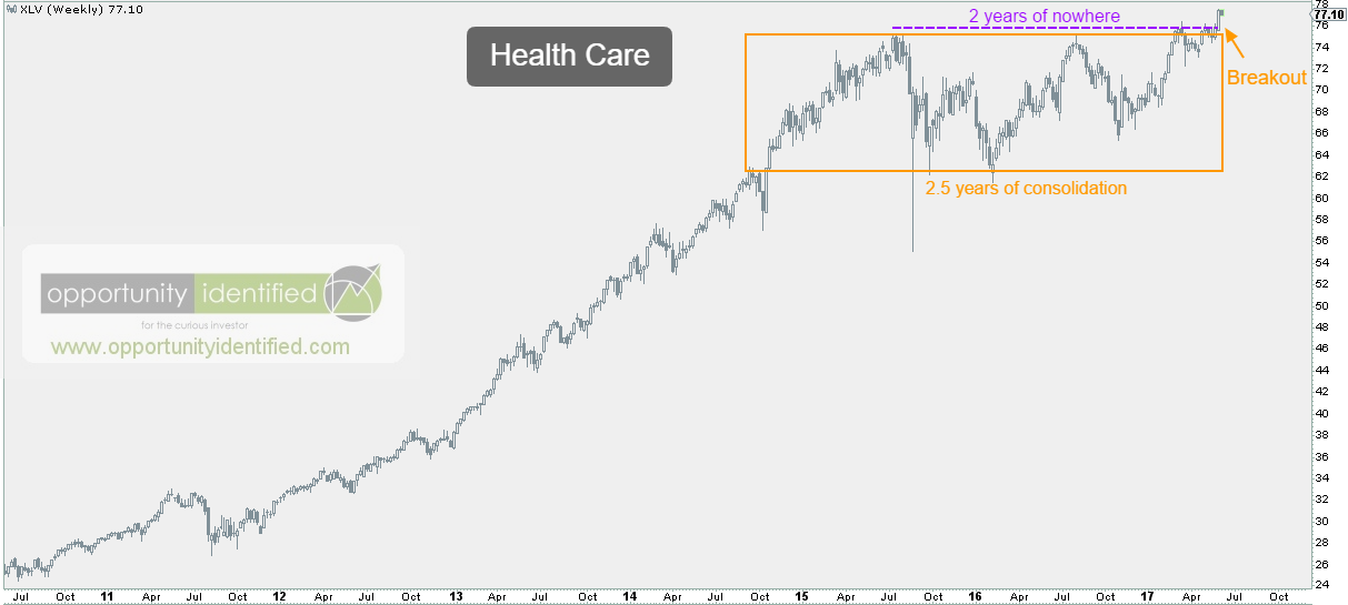
Since July 2015, Health Care has gone nowhere. For 2 years, this important U.S. sector has been correcting through time. During this time frame, Health Care (represented by ETF XLV here), experienced a 16% drawdown. But when we look at it from a long-term perspective, the sideways price consolidation is most prevalent. And when we look at it compared to the overall market (using the S&P 500 as our proxy), we can see market participants had no business owning Health Care during the past 2 years:

Health Care vs S&P 500 Weekly Chart

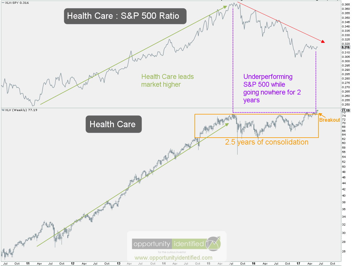
Health Care represents approximately 14% of the S&P 500. When we look left, we see that from 2011 through mid-2015, Health Care was a major factor in leading the S&P 500 higher. Of the major market sectors during this time frame, Health Care was one of the best. That changed in 2015 as the Health Care selloff affected the broad market overall. Since mid-2015, Health Care has not been a sector worth owning. With the recent breakout of Health Care on an absolute basis, this relative underperformance could be changing and would be an important development in leading the overall market higher.

We can make money in Health Care (using XLV) with proper entry and risk management. Using the daily chart below, we can tactically identify risk, our number one priority as market participants.

Daily Chart of Health Care

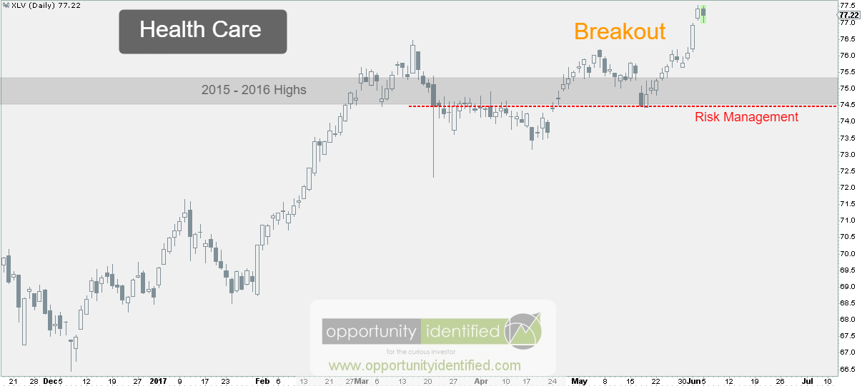
The $73.50-74.50 level is an important one. In 2015, and again in 2016, sellers showed up at this level to drive price back down. The recent break above this level is important, as polarity is now in play. Meaning, once an area of former supply is broken, it should now serve as an area of support. Of course, nothing is guaranteed, which is why every market participant needs an exit plan prior to entry. When is this trade wrong? If price moves below 73.50-74.50, it no longer makes sense to own XLV. A sustained amount of time above this level will signify buyers are in control and an initial target of $90 is on the table. That’s a 16% gain and represents a reward:risk ratio of 5:1. We like that.

In the end, it’s quite simple. It makes sense to own XLV above 73.50-74.50 (depending on your risk tolerance). Below that, it can be someone else’s problem. As always, trade at your own risk. It’s our responsibility to stay on the right side of the trade regardless of our opinions.

As always, you can get real-time updates and commentary about this development and many more opportunities here: @360Research

AND, you’ve got FREE access to a time-saving tool we’ve created, The Ultimate ETF Cheat Sheet. Click this link to get your FREE easy-to-use resource guide for all your ETF needs.


Disclaimer: Nothing in this article should be construed as investment advice or a solicitation to buy or sell a security. You invest based on your own decisions. Everything in this post is meant for educational and entertainment purposes only. I or my affiliates may hold positions in securities mentioned in this blog. Please see our Disclosure page for full disclaimer.

Filed Under: Breakout, Equity, ETF, Health Care, Ratio Analysis, Relative Strength Analysis, Sector, Supply and Demand, Techniques & Tactics Tagged With: $FXH, $XLV, Health Care, Healthcare

November 20, 2014 | Posted by David Zarling, Head of Investment Research

Leader of the Pack [Weight of Evidence, Part 5 of 7]

0
0
0
0
0
0
0
0
0
0
0
0
0
0
0
0
0
0
0
0
0
0
0
0

Weight of Evidence: Part 1 | Part 2 | Part 3 | Part 4 | Part 5 | Part 6 | Part 7

At 360 Investment Research, we like to dig deep into the market and take a look at what sectors are leading the US market upward. By analyzing sectors on a relative basis against the S&P 500, we can gain insight into what sectors are leading the charge. This, in turn, may provide clues on where we are in the market/economic cycle. The theoretical market/economic cycle is a model based on the work of Sam Stovall in his book, S&P’s Guide to Sector Rotation. The basic premise is that different sectors are stronger at different points in the economic cycle. StockCharts.com has done a great job elaborating on this rotational cycle. The chart below is courtesy of StockCharts.com. It does a good job of visualizing these relationships and the order in which each sector should outperform in the context of the overall market. Moving from left to right, we see that Cyclicals (or Consumer Discretionary) and Technology lead the market out of bottoms. Industrials, Basic Materials, and Energy lead during a Bull Market. And Staples, Healthcare, Utilities, and Finance are the safe havens during Bear Markets. It’s not as clear cut as what I just wrote or what is visualized below, but it is a really great guide to the likely relative performance characteristics of each sector as the market progresses.

Sector Rotation Model - Stockcharts

Researching approximately how each sector is performing can be a good exercise in determining where we might be in the overall market cycle. Obviously, if we’re in a healthy Bull Market, we want to see Bull Market leaders like Technology, Industrials, Materials and Energy outperforming (or leading) the overall market. Conversely, we would be concerned about the overall prospects of the market and economy if we see that big money is moving into defensive sectors like Staples, Healthcare, and Utilities. So let’s dig in and see what sectors are leading the overall market.

One of the best ways of observing which sectors are doing the best and which sectors are lagging is through the use of Relative Rotation Graphs (RRG) [1]. RRG charts show us the relative strength and momentum for a group of stocks or ETFs. These stocks or ETFs are compared against a benchmark. In our case, we’re going to compare the aforementioned sectors using the overall market (the S&P 500) as our benchmark. That is to say, the performance of each of these sectors will be compared against the performance of the S&P 500. If a sector is outperforming the market, they are said to be the leaders. If a sector is underperforming the market, they are the laggards. On the RRG chart below, the following ETFs are being used as proxies for each sector:

  • XLY (Cyclicals or Consumer Discretionary)
  • XLK (Technology)
  • XLI (Industrials)
  • XLB (Materials)
  • XLE (Energy)
  • XLP (Staples)
  • XLV (Health Care)
  • XLU (Utilities)
  • XLF (Financials)

Of the ETFs above, those with strong relative strength and momentum in comparison to the S&P 500 appear in the green Leading quadrant. Those with relative momentum fading move into the yellow Weakening quadrant. If relative strength then fades, they move into the red Lagging quadrant. And when momentum starts to pick up again, they shift into the blue Improving quadrant. In the RRG below, the long tails represent the movement of each sector over the past 20 weeks in comparison to the S&P 500. So what do we see? We see that  XLV, XLU, XLP, and XLF have moved from positions of weakness and laggards to positions of leadership. Health Care (XLV), Utilities (XLU), Staples (XLP), and Financials (XLF) – defensive sectors – are leading this market. On the other hand, Technology (XLK) is weakening while Energy (XLE), Materials (XLB), and Cyclicals (XLY) are lagging. Bluntly, defensive stocks are leading and those who we want to lead a Bull Market are lagging. Money is flowing into defensive sectors. This is not what a healthy and powerful Bull Market looks like. Does it mean that this the top of the Bull Market? No one knows that. But, enough money is flowing into defensive sectors that investors like you and me should take notice.

[1]  Note: The terms “Relative Rotation Graph” and “RRG” are registered trademarks of RRG Research.

11-21-2014 Leader of the Pack RRG [weight of evidence, 5 of 7]

Weight of Evidence: Part 1 | Part 2 | Part 3 | Part 4 | Part 5 | Part 6 | Part 7

Filed Under: Consumer Discretionary, Consumer Staples, Energy, Equity, ETF, Financials, Health Care, Industrials, Materials, Relative Strength Analysis, Rotational Regression Graphs, Sector, Sector Rotation, Techniques & Tactics, Technology, Utilities Tagged With: $SPX, $XLB, $XLE, $XLF, $XLI, $XLK, $XLP, $XLU, $XLV, $XLY, Consumer Discretionary, Defensive stocks, Economic Cycle, Energy, Financials, Health Care, Industrials, Laggards, Leaders, Market Cycle, Materials, Relative Rotation Graph, RRG, RRG Research, S&P 500, S&P's Guide to Sector Rotation, Sam Stovall, Sector Rotation, Sectors, Staples, Stockcharts.com, Technology, Utilities

Find Out Our Top 10 Questions to Ask Your Financial Adivsor!

Subscribe to our mailing list today. No spam - we promise!

* indicates required
Tweets by @@360Research

Recent Posts

  • How To Get Involved In The Drug Trade (It’s Not What You Think!)
  • Invaluable Market Signal From The Value Line Geometric Index
  • This Is How To Navigate Amazon
  • Get Intel Inside Your Portfolio
  • Simple Market Secret: Just Look Left

Tags

$DBO $ES_F $INDU $SH $SPX $SPXA200 $SPY $TNX $USD $USDJPY $UUP $VIX $WTIC Bonds breakout Confluence Consolidation Cycles demand descending triagle divergence Dow Jones measured move Nike NKE Oil Price Resistance risk/reward risk management RSX Russell 2000 Russia RUT S&P 500 S&P500 SPY stock pickers market Supply TLT Trend Change trendline US Dollar Volatility weight of evidence

Copyright 360 Investment Research, LLC - All rights reserved © 2021