Opportunity Identified

for the curious investor

  • Home
  • About
    • Founder’s Story
    • This Blog
    • 360 Investment Research
    • The 360 Process
    • Client First Tax and Wealth Advisors
  • Insiders Only
  • Contact Us

August 1, 2017 | Posted by David Zarling, Head of Investment Research

This Stock Market Rotation Has Some Energy Behind It

0
0
0
0
0
0
0
0
0
0
0
0
0
0
0
0
0
0
0
0
0
0
0
0

It’s always good to take some time off, step back, and refresh. During our short leave, we received inquiries on when our next blog post would be released. Your feedback and demand for our work are appreciated. The idea that we’re providing valuable information is motivating. Our break is over and we’re back with some more market insights you might find useful. Today’s update involves a major industrial sector that has been underperforming for a long time: Energy. For over 9 years, the Energy sector has underperformed the broad market. Don’t believe us? Take a look.

Energy v S&P 500 Ratio Chart

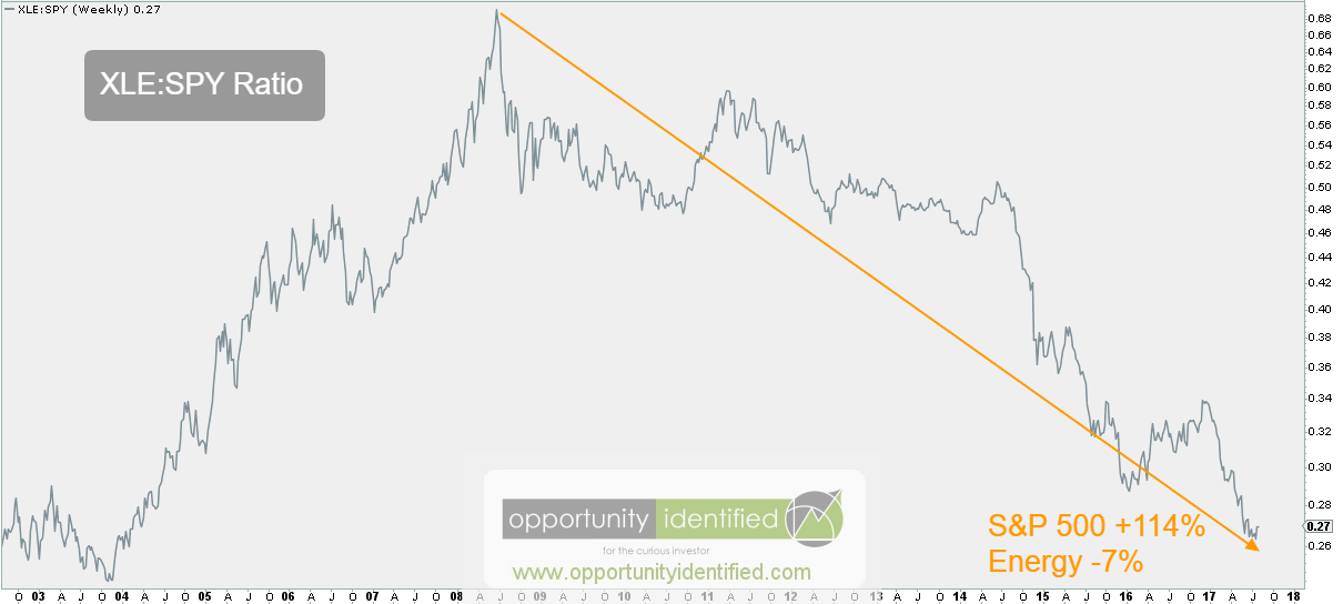
Above is a weekly chart of Energy (using ETF, XLE) versus the S&P 500 (using ETF, SPY). Simply put, when the ratio rises, XLE is outperforming. When the ratio falls, SPY is outperforming. Since mid-2008, Energy has been nothing but a hot mess. From June 2008 through today, if you were involved in Energy, you lost 7% of your capital while the broad market represented by the S&P 500 appreciated 114%. Talk about opportunity cost.

Within this 9-year period, however, there have been countertrend moves worth participating in. For example, Energy outperformed the S&P 500 +29% versus +12% in calendar year 2016. Not too shabby. But as the chart above highlights, the bigger trend is down. So what we’re shedding light on here today is NOT an opportunity with the winds of a larger trend at its back. What is notable, however, is the recent breakout of Energy on an absolute and relative basis.

Energy Daily price chart

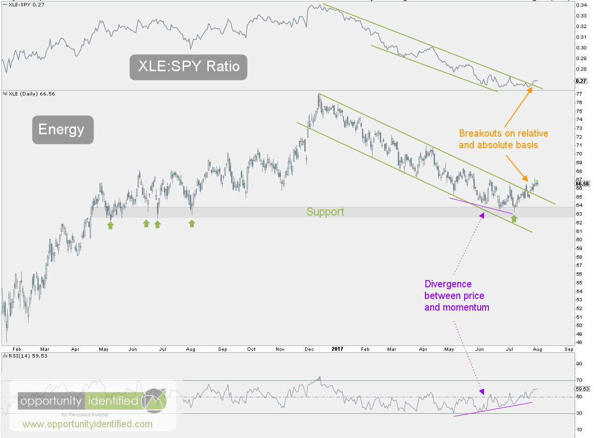
We can clearly see buyers have changed the trajectory of price with XLE breaking out on an absolute basis and on a relative basis versus the S&P 500. This development is in conjunction with a divergence between price and momentum and buyers stepping in a logical support level near $63. In addition, price has recorded and higher low and higher high on this time frame. That’s the very definition of a trend change. As long as XLE can hold and sustain above $66.17, this countertrend move in energy will have legs. With an upside target near $70, this set-up has a friendly reward-to-risk ratio of almost 8-to-1.

To conclude, while we’re not in the business of picking a bottom in Energy, it’s quite possible this recent move is something worth participating in. The game plan is simple. Above $66, own XLE. Below that, it can be someone else’s problem. Trade at your own risk.

As always, you can get real-time updates and commentary about this development and many more opportunities here: @360Research

By the way, we created this free tool for you, The Ultimate ETF Cheat Sheet. It’s an easy-to-use ETF resource guide. We think you’ll like it.


Disclaimer: Nothing in this article should be construed as investment advice or a solicitation to buy or sell a security. You invest based on your own decisions. Everything in this post is meant for educational and entertainment purposes only. I or my affiliates may hold positions in securities mentioned in this blog. Please see our Disclosure page for full disclaimer.

Filed Under: Breakout, Commodity, Energy, Energy, Equity, ETF, Market Outlook, Ratio Analysis, Sector Tagged With: $FXN, $SPX, $SPY, $XLE, Energy, S&P 500, SPY

November 20, 2014 | Posted by David Zarling, Head of Investment Research

Leader of the Pack [Weight of Evidence, Part 5 of 7]

0
0
0
0
0
0
0
0
0
0
0
0
0
0
0
0
0
0
0
0
0
0
0
0

Weight of Evidence: Part 1 | Part 2 | Part 3 | Part 4 | Part 5 | Part 6 | Part 7

At 360 Investment Research, we like to dig deep into the market and take a look at what sectors are leading the US market upward. By analyzing sectors on a relative basis against the S&P 500, we can gain insight into what sectors are leading the charge. This, in turn, may provide clues on where we are in the market/economic cycle. The theoretical market/economic cycle is a model based on the work of Sam Stovall in his book, S&P’s Guide to Sector Rotation. The basic premise is that different sectors are stronger at different points in the economic cycle. StockCharts.com has done a great job elaborating on this rotational cycle. The chart below is courtesy of StockCharts.com. It does a good job of visualizing these relationships and the order in which each sector should outperform in the context of the overall market. Moving from left to right, we see that Cyclicals (or Consumer Discretionary) and Technology lead the market out of bottoms. Industrials, Basic Materials, and Energy lead during a Bull Market. And Staples, Healthcare, Utilities, and Finance are the safe havens during Bear Markets. It’s not as clear cut as what I just wrote or what is visualized below, but it is a really great guide to the likely relative performance characteristics of each sector as the market progresses.

Sector Rotation Model - Stockcharts

Researching approximately how each sector is performing can be a good exercise in determining where we might be in the overall market cycle. Obviously, if we’re in a healthy Bull Market, we want to see Bull Market leaders like Technology, Industrials, Materials and Energy outperforming (or leading) the overall market. Conversely, we would be concerned about the overall prospects of the market and economy if we see that big money is moving into defensive sectors like Staples, Healthcare, and Utilities. So let’s dig in and see what sectors are leading the overall market.

One of the best ways of observing which sectors are doing the best and which sectors are lagging is through the use of Relative Rotation Graphs (RRG) [1]. RRG charts show us the relative strength and momentum for a group of stocks or ETFs. These stocks or ETFs are compared against a benchmark. In our case, we’re going to compare the aforementioned sectors using the overall market (the S&P 500) as our benchmark. That is to say, the performance of each of these sectors will be compared against the performance of the S&P 500. If a sector is outperforming the market, they are said to be the leaders. If a sector is underperforming the market, they are the laggards. On the RRG chart below, the following ETFs are being used as proxies for each sector:

  • XLY (Cyclicals or Consumer Discretionary)
  • XLK (Technology)
  • XLI (Industrials)
  • XLB (Materials)
  • XLE (Energy)
  • XLP (Staples)
  • XLV (Health Care)
  • XLU (Utilities)
  • XLF (Financials)

Of the ETFs above, those with strong relative strength and momentum in comparison to the S&P 500 appear in the green Leading quadrant. Those with relative momentum fading move into the yellow Weakening quadrant. If relative strength then fades, they move into the red Lagging quadrant. And when momentum starts to pick up again, they shift into the blue Improving quadrant. In the RRG below, the long tails represent the movement of each sector over the past 20 weeks in comparison to the S&P 500. So what do we see? We see that  XLV, XLU, XLP, and XLF have moved from positions of weakness and laggards to positions of leadership. Health Care (XLV), Utilities (XLU), Staples (XLP), and Financials (XLF) – defensive sectors – are leading this market. On the other hand, Technology (XLK) is weakening while Energy (XLE), Materials (XLB), and Cyclicals (XLY) are lagging. Bluntly, defensive stocks are leading and those who we want to lead a Bull Market are lagging. Money is flowing into defensive sectors. This is not what a healthy and powerful Bull Market looks like. Does it mean that this the top of the Bull Market? No one knows that. But, enough money is flowing into defensive sectors that investors like you and me should take notice.

[1]  Note: The terms “Relative Rotation Graph” and “RRG” are registered trademarks of RRG Research.

11-21-2014 Leader of the Pack RRG [weight of evidence, 5 of 7]

Weight of Evidence: Part 1 | Part 2 | Part 3 | Part 4 | Part 5 | Part 6 | Part 7

Filed Under: Consumer Discretionary, Consumer Staples, Energy, Equity, ETF, Financials, Health Care, Industrials, Materials, Relative Strength Analysis, Rotational Regression Graphs, Sector, Sector Rotation, Techniques & Tactics, Technology, Utilities Tagged With: $SPX, $XLB, $XLE, $XLF, $XLI, $XLK, $XLP, $XLU, $XLV, $XLY, Consumer Discretionary, Defensive stocks, Economic Cycle, Energy, Financials, Health Care, Industrials, Laggards, Leaders, Market Cycle, Materials, Relative Rotation Graph, RRG, RRG Research, S&P 500, S&P's Guide to Sector Rotation, Sam Stovall, Sector Rotation, Sectors, Staples, Stockcharts.com, Technology, Utilities

Find Out Our Top 10 Questions to Ask Your Financial Adivsor!

Subscribe to our mailing list today. No spam - we promise!

* indicates required
Tweets by @@360Research

Recent Posts

  • How To Get Involved In The Drug Trade (It’s Not What You Think!)
  • Invaluable Market Signal From The Value Line Geometric Index
  • This Is How To Navigate Amazon
  • Get Intel Inside Your Portfolio
  • Simple Market Secret: Just Look Left

Tags

$DBO $ES_F $INDU $SH $SPX $SPXA200 $SPY $TNX $USD $USDJPY $UUP $VIX $WTIC Bonds breakout Confluence Consolidation Cycles demand descending triagle divergence Dow Jones measured move Nike NKE Oil Price Resistance risk/reward risk management RSX Russell 2000 Russia RUT S&P 500 S&P500 SPY stock pickers market Supply TLT Trend Change trendline US Dollar Volatility weight of evidence

Copyright 360 Investment Research, LLC - All rights reserved © 2021