Opportunity Identified

for the curious investor

  • Home
  • About
    • Founder’s Story
    • This Blog
    • 360 Investment Research
    • The 360 Process
    • Client First Tax and Wealth Advisors
  • Insiders Only
  • Contact Us

October 13, 2017 | Posted by David Zarling, Head of Investment Research

How To Get Involved In The Drug Trade (It’s Not What You Think!)

0
0
0
0
0
0
0
0
0
0
0
0
0
0
0
0
0
0
0
0
0
0
0
0

Eli Lilly & Co. (ticker: LLY), one of the world’s largest drug manufacturers, has seen its stock go nowhere for 2 years. We don’t know many participants who would like a 0% return for 24 months. But this nowhere action is perfectly normal behavior. After all, Eli Lilly was up over 350% from the bottom in 2009 through September 2015. That’s a pretty nice return, but trees don’t grow to the moon and LLY couldn’t continue that pace without some digestion. And since September 2015, LLY has corrected and consolidated through price and time. If you’re familiar with our work, you know corrections through price and time provide opportunities. By studying supply and demand, we can identify when an opportunity with low risk / high reward characteristics is upon us. Eli Lilly is another such opportunity. Last week, LLY broke out of the aforementioned 2-year base. Check it out:

Eli Lilly LLY Weekly Breakout Chart

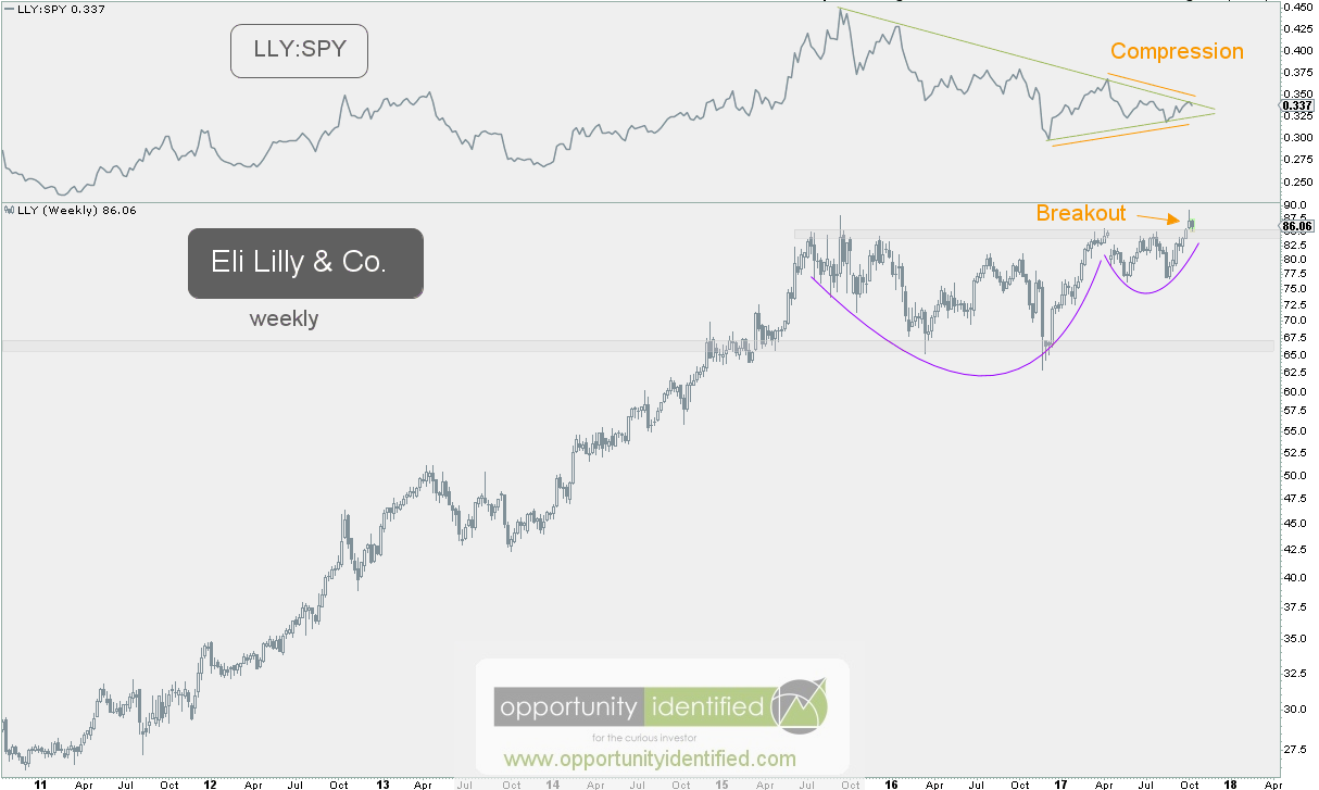
Not only that, but LLY is on the verge of breakout out on a relative basis versus the S&P 500. We like absolute and relative breakouts. And we like large bases. From large bases come high spaces. The 2-year base built by supply and demand is large and has strong polarity characteristics. For those non-believers who think buyers and sellers don’t remember the prospects of a stock from 17 years ago, we present the following:
Eli Lilly LLY Weekly Chart Price Memory

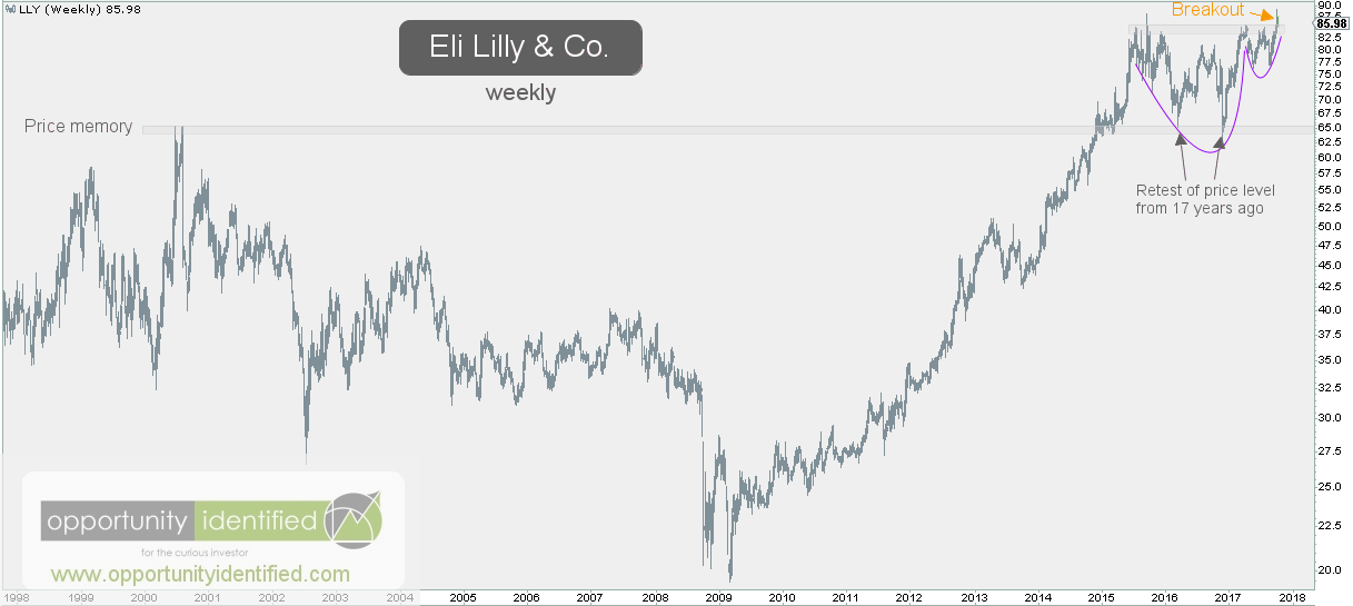
Historical prices have significance. They are not random as some would have you believe. But we digress. Let’s identify how to get on the right side of the trade with LLY.

Here’s the daily chart of LLY:

Eli Lilly LLY Daily Chart

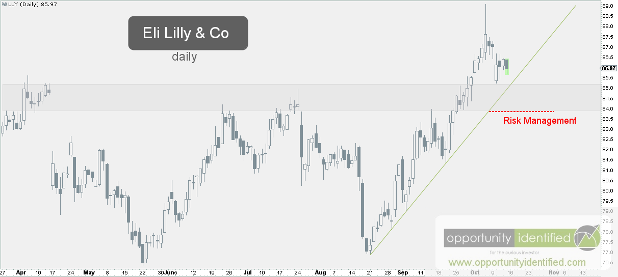
Buyers drove the price of LLY above $85. We’ve seen a subsequent retest of that important level. Everyone has their own time frame and objective. But to us, it makes sense to own Eli Lilly above $84. With an upside target of $105, the reward-to-risk ratio is tilted in our favor. Below $84, and we’re wrong. After all, we’re not in the market to be right. We’re in the market to make money, which means being on the right side of the trade.

In conclusion, Eli Lilly has just broken out of a large 2-year base with the potential for a nice reward (about 20%) and defined risk (about 2%). We like this 10:1 tilt in our favor. As always, price knows best. Trade at your own risk.

You can get real-time updates and commentary about this development and many more opportunities here: @360Research

AND, you’ve got FREE access to a great tool we’ve created, The Ultimate ETF Cheat Sheet. Click this link to get your FREE easy-to-use resource guide for all your ETF needs.


Disclaimer: Nothing in this article should be construed as investment advice or a solicitation to buy or sell a security. You invest based on your own decisions. Everything in this post is meant for educational and entertainment purposes only. I or my affiliates may hold positions in securities mentioned in this blog. Please see our Disclosure page for full disclaimer.

Filed Under: Breakout, Equity, Health Care, Relative Strength Analysis, Risk Management, Supply and Demand Tagged With: $IHE, $XHP, Drug Manufacturer, Eli Lilly, LLY, Pharma, Pharmaceuticals

October 2, 2017 | Posted by David Zarling, Head of Investment Research

Invaluable Market Signal From The Value Line Geometric Index

0
0
0
0
0
0
0
0
0
0
0
0
0
0
0
0
0
0
0
0
0
0
0
0

As market participants, we should be taking a scientific approach when putting money to work, always assuming our positions are wrong and need to prove themselves. As part of that process, one piece of evidence we want to look at on a consistent basis is the health of the overall market. One such way to gauge market health is studying market breadth. In other words, how many stocks are actually participating in any directional move. That’s why we’re writing today about an index you might not be aware of but should be familiar with if you follow our research. This index is great at providing insight into the current condition of the U.S. stock market: the Value Line Geometric Index (XVG). This index tracks the median move of stocks within the index using the assumption that each stock has an equal amount (for example, $1,000) invested in them. The daily average move of this index is calculated geometrically (rather than arithmetically). If you want to geek out on the details, you can read more about this calculation here, page 4. In basic terms, the Value Line Geometric Index eliminates an illusion created by cap-weighted index components. Heavily weighted stocks within a cap-weighted index can pull it higher even as the majority of the stocks within the index are not following along. For example, in a cap-weighted index like the S&P 500, it’s possible for the top 100 weighted stocks to carry the index higher while the remaining 400 stocks lose value. As an investor, it might be helpful to identify when this is happening.

The last time we wrote about this Index, we noted it needed to hold and advance beyond the $500 level. Here’s the chart of the Value Line Geometric and S&P 500 Indexes from that post.

Value Line Geometric Index Big Picture


Here’s an updated chart comparing the popular cap-weighted S&P 500 Index with the lesser-known Value Line Geometric Index:


Value Line Geometric Index Updated

The last few weeks have been confirming evidence for our bullish market thesis. XVG held the important $500 level and advanced swiftly to all-time-highs. You read that right. This is the highest Value Line Geometric Index has been. Ever. In fact, this move is confirming a breakout of a 19-year consolidation. Note that price broke above the 1998 highs just this past December. That’s almost 20 years of going nowhere! And last week’s move was a breakout of the more recent 10-month consolidation. Check it out:

Value Line Geometric Index Up Close

From large bases come high spaces. This move is significant and is signaling broad market participation, which is not a bearish characteristic. The last time we covered this important index was back in May. Back then, large market cap stocks were leading the S&P 500 market higher. We wrote:

…we’ll want to watch for clues from the leading sector, Technology, on whether this current run can continue. It’s a positive when economic bellwethers like Apple (AAPL), Amazon (AMZN), Facebook (FB), Google (GOOGL), Nvidia (NVDA), Adobe (ADBE), Microsoft (MSFT), and Netflix (NFLX) can lead. At the same time, it would be healthy if more sectors start to participate. If and when laggards like Energy and Financials find demand, it could signal another strong leg higher for the overall market. 

What have Energy and Financials done recently? We thought you’d never ask.

Energy and Financials Daily Charts

In conclusion, we have evidence right in front of our eyes showing broad market participation and lagging sectors getting bid. This is healthy and normal bull market behavior. We’re not saying that Energy and Financials continue to march straight upward. Trees don’t grow to the moon. But it is significant that lagging sectors are participating and the Value Line Geometric Index is breaking out. This evidence could be signaling another strong leg higher for the overall market.

As always, you can get real-time updates and commentary about this development and many more opportunities here: @360Research

AND, you’ve got FREE access to a great tool we’ve created, The Ultimate ETF Cheat Sheet. Click this link to get your FREE easy-to-use resource guide for all your ETF needs.


Disclaimer: Nothing in this article should be construed as investment advice or a solicitation to buy or sell a security. You invest based on your own decisions. Everything in this post is meant for educational and entertainment purposes only. I or my affiliates may hold positions in securities mentioned in this blog. Please see our Disclosure page for full disclaimer.

Filed Under: Breakout, Energy, Financials, Intermarket Analysis, Market Breadth, Market Outlook, Other, Participation, Pattern Recognition, S&P 500, Sector, Supply and Demand, Techniques & Tactics Tagged With: $SPX, $SPY, Market Breadth, S&P 500, SPY, Value Line Geometric Index, XVG

September 28, 2017 | Posted by David Zarling, Head of Investment Research

This Is How To Navigate Amazon

0
0
0
0
0
0
0
0
0
0
0
0
0
0
0
0
0
0
0
0
0
0
0
0

Much like its namesake, Amazon stock (ticker: AMZN) is difficult, yet rewarding, to navigate. Over the past two decades, this well-known retail (not technology) company has risen over 48,455%. That’s not a typo. $1,000 invested in AMZN back in 1997 would be worth $484,558 today. That same $1000 invested in the S&P 500 would be worth $1,999 today. Making money in the stock market is easy, right? Wrong. As much as we’d like to think we’re rational individuals, we’re our own worst enemy. When involved with markets, we tend to respond to gains and losses emotionally. Loss aversion is a real and present danger to many portfolios. Here’s a visual of this common emotional experience.

Prospect Theory Loss Aversion

Many market participants experience twice as much pain during drawdowns than the joy experienced during equivalent gains. So what would it have been like to hold on to Amazon since 1997? How bad would the pain have been? Take a look:

Amazon Drawdowns[original chart source]

The upper pane (green) is the price appreciation of AMZN stock. Using hindsight bias, many think the tremendous gains in Amazon were a slam dunk and easy to come by. That couldn’t be further from the truth. The lower pane (red) are the drawdowns experienced by holders of AMZN stock. Talk about agony. For more than a third of its life as a public company, Amazon has been in a 50+% drawdown. For the buy-and-hold investor, it’s hard to imagine the discipline needed to hold on during 70-90% losses. It’s likely many capitulated under the duress. The good news is, we don’t have to be buy-and-hope investors. In fact, we might even call drawdowns a downtrend! Remember, our number one job as market participants is to manage risk and protect capital. Using supply and demand dynamics (aka price movement) to do so, there is zero reason to experience such massive drawdowns. Let’s take a look at the buying and selling going on with AMZN.

Here’s the weekly chart:

Amazon Weekly Chart

For a while now, AMZN has been making a series of higher highs and higher lows. This is normal behavior for uptrending stocks. This doesn’t mean Amazon doesn’t experience sideways consolidation from time-to-time. All of 2014 was an intermediate downtrend / consolidation prior to resuming its uptrend ways. Even then, we would’ve been able to recognize a price momentum change using a trendline dating back to 2012. And more recently, we saw AMZN break a price momentum trendline (green) back in August. This took place both on an absolute and relative (to SPY) basis. This was a clue to let someone else have AMZN. It doesn’t necessarily mean impending doom. A broken price momentum trendline just means the demand/supply dynamic has shifted. Back then, we tweeted (click here to follow real-time supply/demand analysis) AMZN would likely form a Head & Shoulders pattern:

AMZN Tweet from August

Many people use patterns to confirm their biases rather than create if/then binary decision-making scenarios. For example, the Head & Shoulders pattern itself has gotten a bad reputation as a “Topping Pattern.” In reality, Head & Shoulder’s patterns are a compression in price as the disparity between buying urgency and selling urgency narrows. So here we are at the end of September talking about the Head & Shoulders pattern in AMZN. See the daily chart below:

AMZN Head and Shoulders Pattern Daily Chart

Amazon has gone nowhere for five months. The battle between supply and demand has created a well-defined Head & Shoulders pattern. Is this a top? We have no idea. No one does. Don’t let anyone tell you otherwise. It could simply be a five-month consolidation. Afterall, consolidations tend to resolve in the direction of the primary trend. This could be a top. It could also be consolidation before heading higher. Our job is not be right or wrong. Our job is to be on the right side of the trade. Let’s a look a little closer to identify some important support levels.

AMZN Daily Chart Risk Management

Up close, we can see buyers have shown up before near the 935 price level. If they don’t show up at this level upon any retest of that price point, we have the evidence we need to make a decision and let someone else have AMZN. From an upside target perspective, Amazon will need to first clear the downtrend line (in green) and then sustain above the left shoulder highs near 1,011. If it can close above, and hold, those levels, it’s like a new series of higher highs and higher lows are upon us. Another possibility is price continues to be range bound between 935 and 1,000 through the end of the year (this would bring time symmetry to the right shoulder, matching the time duration of the left shoulder). Trade accordingly.

In conclusion, the game plan is simple. If Amazon closes below 935, we want nothing to do with it. Above that level, it makes sense to own one of the top three appreciating stocks of the past decade. Get yourself on the right side of the trade. We don’t need to experience capital crushing drawdowns. Trade at your own risk.

As always, you can get real-time updates and commentary about this development and many more opportunities here: @360Research

AND, you’ve got FREE access to a great tool we’ve created, The Ultimate ETF Cheat Sheet. Click this link to get your FREE easy-to-use resource guide for all your ETF needs.


Disclaimer: Nothing in this article should be construed as investment advice or a solicitation to buy or sell a security. You invest based on your own decisions. Everything in this post is meant for educational and entertainment purposes only. I or my affiliates may hold positions in securities mentioned in this blog. Please see our Disclosure page for full disclaimer.

Filed Under: Consumer Discretionary, Consumer Staples, Equity, Other, Pattern Recognition, Ratio Analysis, Relative Strength Analysis, Risk Management, Sector, Supply and Demand, Techniques & Tactics, Trend Analysis Tagged With: $AMZN, $SPX, $SPY, $XRT, Amazon, Amazon.com, Retail, SPY

September 20, 2017 | Posted by David Zarling, Head of Investment Research

Get Intel Inside Your Portfolio

0
0
0
0
0
0
0
0
0
0
0
0
0
0
0
0
0
0
0
0
0
0
0
0

Get Intel in your portfolio. Sometimes market participants forget we’re in the market to make money. Contrary to the cacophonous media echo chambers, we’re not in the market to be right or wrong. Media may love opinions, but markets couldn’t care less about what we think. Markets are not our friends. They don’t care if we’re right or wrong, so we better be in the business of getting on the right side of the trade, managing risk, and capturing reward. With this in mind, it makes sense to own things moving up in both absolute and relative terms. Price moving upward in absolute terms is nice, but capturing trends that are moving up faster than the market itself can set our portfolios up for outperformance. One such opportunity we’ve identified is Intel (ticker: INTC). For over a year, INTC has done jack squat. Price has moved between $33 and $37 per share in a battle between supply and demand. This sideways consolidation has built a nice base right above the 2014 highs. From long bases, come high spaces. Let’s dig into the data.

To get a big picture perspective of Intel, here’s a weekly chart INTC:Intel Weekly Chart

Notice how INTC has been a large scale uptrend for a while now with massive two-year accumulation pattern (annotated in purple) which took it to new highs. Since the 2016 high, however, INTC has been consolidating sideways. The one-year supply and demand battle is normal and healthy price behavior. We also notice that from a relative performance perspective (upper pane), INTC has broken its relative downtrend versus the S&P 500 (using SPY as our proxy). This is a new piece of evidence squarely the court of owning INTC.

Now, let’s get a little more tactical with a daily chart of Intel:

Intel Daily Chart

Not until recently did INTC breakout from this sideways consolidation and breakout from a downtrend relative to the S&P 500. This is quality accumulation and change in relative trend behavior. Our number one responsibility when taking on a new position is risk management. Monitoring supply and demand allows us to identify when we’re wrong. When we can identify our risk (and reward), it allows us to determine whether the new position is worth the risk. In this case, we know we’re wrong below $35.80, which is 3% below current price and defines our risk. On the flip side, the upward target is $43 (it could go higher), which is about 14% higher from here. Risk of 3% and reward of 14% (or higher), which is a risk/reward ratio of almost 1:5. Not too bad.

In conclusion, the game plan is simple: we’ve identified an opportunity with a 1:5 risk/reward ratio. Above $35.80, it makes sense to own INTC. Below that and someone else can have it. Everyone is different. Know your time frame. Trade at your own risk.

As always, you can get real-time updates and commentary about this development and many more opportunities here: @360Research

AND, you’ve got FREE access to great tool we’ve created, The Ultimate ETF Cheat Sheet. Click this link to get your FREE easy-to-use resource guide for all your ETF needs.


Disclaimer: Nothing in this article should be construed as investment advice or a solicitation to buy or sell a security. You invest based on your own decisions. Everything in this post is meant for educational and entertainment purposes only. I or my affiliates may hold positions in securities mentioned in this blog. Please see our Disclosure page for full disclaimer.

Filed Under: Breakout, Equity, Other, Relative Strength Analysis, Sector, Supply and Demand, Techniques & Tactics, Technology, Trend Analysis Tagged With: $SPY, INTC, Intel

September 18, 2017 | Posted by David Zarling, Head of Investment Research

Simple Market Secret: Just Look Left

0
0
0
0
0
0
0
0
0
0
0
0
0
0
0
0
0
0
0
0
0
0
0
0

One of the most important jobs of a market participant is risk management. If you’re unable to identify when your position is wrong, then you shouldn’t be entering a position to begin with. Would we ever enter a crowded room without identifying where the exits are? I don’t think so. We have the same responsibility when entering a new position. At 360 Investment Research, when we enter a new position, we identify risk (and potential reward) by looking left. By looking left on a price chart, we can identify previous changes in supply and demand, which can give clues on where demand or support could appear. By looking left, we can identify when buying momentum wanes and when selling pressure has entered the market. For example, if over a certain time period, price is making a series of lower highs and lower lows, we know sellers have more urgency than buyers for that time period. There is more supply than demand and price is trying to discover where the buyers live. So by looking left, we are using economic law (not opinion) to guide our investment decisions, entries, and exits. Using price removes mystery (and emotion) from our trading process. Let’s go through this exercise with the S&P 500 on daily and weekly time frames to identify where we are with the current market.

First, here’s the daily chart of the S&P 500:

Daily Chart of S&P 500

When we look left, we can see price made of series of higher highs and higher lows from November through March. On March 1st, this important index recorded a new all-time-high. A series of higher highs and higher lows is indicative of a bull market. However, for the remainder of March and most of April, the characteristics of supply and demandchanged. The S&P 500 recorded a series of lower lows and lower highs over that two-month period. This was a downtrend on the daily time frame until a new high was established in mid-May. With the exception of recording a lower high and lower low in August, the sequence of higher highs and higher lows in one the world’s most important indexes has been relentless. Relentless higher highs and higher lows are classic bull market behavior.

Now for the weekly timeframe:

S&P 500 Weekly Chart

When looking left at the weekly data, it’s clear the S&P 500 is currently in a series of higher highs and higher lows. So, can the market be in a downtrend on the daily timeframe and an uptrend on the weekly timeframe? Absolutely. That’s exactly what we had back in March / April. By looking left on both the daily and weekly timeframes, we can gain a better understanding of market trends. It’s not the only thing we look at, but it’s a big piece of evidence. And the current assessment has the S&P 500 in a daily uptrend within the friendly confines of a weekly uptrend. We’re not ones to argue with price. These higher highs and higher lows are normal behavior for a bull market.

With the bullish uptrend clearly outlined for both the daily and weekly time frames, we need to acknowledge trees don’t grow to the moon and markets don’t go up forever. So where would one look for clues this market is changing from an uptrend to a downtrend? You guessed it. Look left. If sellers were to drive price down from here, we can quickly identify buyers have shown up near the 2425 level. On both the daily and weekly timeframes, that’s an important level to watch. If the S&P 500 closed below that level, it would be a clue supply and demand are changing in an important way. That’s what we’ll be watching and you should too.

To conclude, as part of our every-day process as market participants, we need to identify sequences of lows and highs. This exercise provides valuable information to help us manage risk and remain on the right side of the trade.

As always, you can get real-time updates and commentary about this development and many more opportunities here: @360Research

AND, you’ve got FREE access to great tool we’ve created, The Ultimate ETF Cheat Sheet. Click this link to get your FREE easy-to-use resource guide for all your ETF needs.


Disclaimer: Nothing in this article should be construed as investment advice or a solicitation to buy or sell a security. You invest based on your own decisions. Everything in this post is meant for educational and entertainment purposes only. I or my affiliates may hold positions in securities mentioned in this blog. Please see our Disclosure page for full disclaimer.

Filed Under: Equity, Market Outlook, Other, Risk Management, S&P 500, Supply and Demand, Techniques & Tactics, Trend Analysis Tagged With: $ES_F, $SPX, $SPY, S&P500, Trend, Trends

  • 1
  • 2
  • 3
  • …
  • 21
  • Next Page »

Find Out Our Top 10 Questions to Ask Your Financial Adivsor!

Subscribe to our mailing list today. No spam - we promise!

* indicates required
Tweets by @@360Research

Recent Posts

  • How To Get Involved In The Drug Trade (It’s Not What You Think!)
  • Invaluable Market Signal From The Value Line Geometric Index
  • This Is How To Navigate Amazon
  • Get Intel Inside Your Portfolio
  • Simple Market Secret: Just Look Left

Tags

$DBO $ES_F $INDU $SH $SPX $SPXA200 $SPY $TNX $USD $USO $UUP $VIX $WTIC $XLP $XLV Ascending Triangle Bonds Bottom breakout Confluence Consolidation Cycles demand descending triagle divergence Dow Jones Energy measured move Price Resistance risk/reward risk management RSX Russia RUT S&P 500 S&P500 SPY Supply TLT Trend Change trendline US Dollar Volatility weight of evidence

Copyright 360 Investment Research, LLC - All rights reserved © 2023