One of the most important jobs of a market participant is risk management. If you’re unable to identify when your position is wrong, then you shouldn’t be entering a position to begin with. Would we ever enter a crowded room without identifying where the exits are? I don’t think so. We have the same responsibility when entering a new position. At 360 Investment Research, when we enter a new position, we identify risk (and potential reward) by looking left. By looking left on a price chart, we can identify previous changes in supply and demand, which can give clues on where demand or support could appear. By looking left, we can identify when buying momentum wanes and when selling pressure has entered the market. For example, if over a certain time period, price is making a series of lower highs and lower lows, we know sellers have more urgency than buyers for that time period. There is more supply than demand and price is trying to discover where the buyers live. So by looking left, we are using economic law (not opinion) to guide our investment decisions, entries, and exits. Using price removes mystery (and emotion) from our trading process. Let’s go through this exercise with the S&P 500 on daily and weekly time frames to identify where we are with the current market.
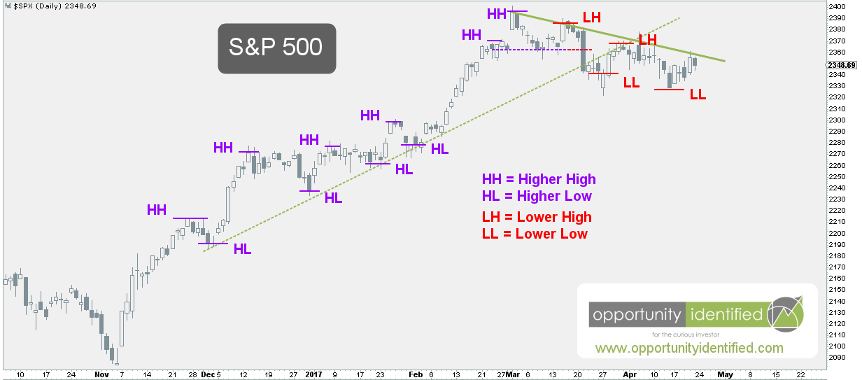
First, here’s the daily chart of the S&P 500:
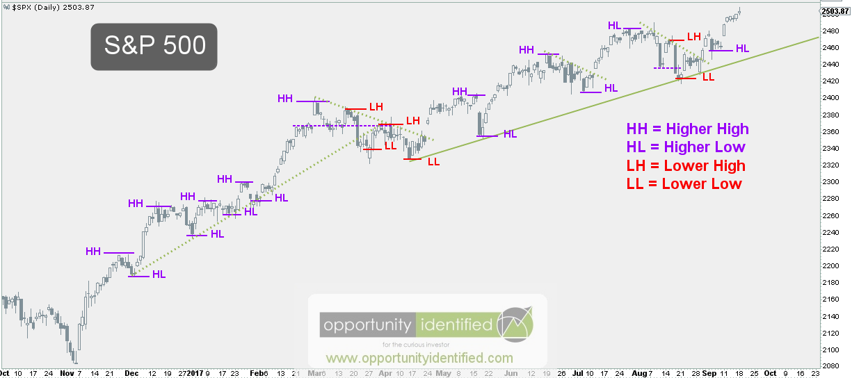
When we look left, we can see price made of series of higher highs and higher lows from November through March. On March 1st, this important index recorded a new all-time-high. A series of higher highs and higher lows is indicative of a bull market. However, for the remainder of March and most of April, the characteristics of supply and demandchanged. The S&P 500 recorded a series of lower lows and lower highs over that two-month period. This was a downtrend on the daily time frame until a new high was established in mid-May. With the exception of recording a lower high and lower low in August, the sequence of higher highs and higher lows in one the world’s most important indexes has been relentless. Relentless higher highs and higher lows are classic bull market behavior.
Now for the weekly timeframe:

When looking left at the weekly data, it’s clear the S&P 500 is currently in a series of higher highs and higher lows. So, can the market be in a downtrend on the daily timeframe and an uptrend on the weekly timeframe? Absolutely. That’s exactly what we had back in March / April. By looking left on both the daily and weekly timeframes, we can gain a better understanding of market trends. It’s not the only thing we look at, but it’s a big piece of evidence. And the current assessment has the S&P 500 in a daily uptrend within the friendly confines of a weekly uptrend. We’re not ones to argue with price. These higher highs and higher lows are normal behavior for a bull market.
With the bullish uptrend clearly outlined for both the daily and weekly time frames, we need to acknowledge trees don’t grow to the moon and markets don’t go up forever. So where would one look for clues this market is changing from an uptrend to a downtrend? You guessed it. Look left. If sellers were to drive price down from here, we can quickly identify buyers have shown up near the 2425 level. On both the daily and weekly timeframes, that’s an important level to watch. If the S&P 500 closed below that level, it would be a clue supply and demand are changing in an important way. That’s what we’ll be watching and you should too.
To conclude, as part of our every-day process as market participants, we need to identify sequences of lows and highs. This exercise provides valuable information to help us manage risk and remain on the right side of the trade.
As always, you can get real-time updates and commentary about this development and many more opportunities here: @360Research
AND, you’ve got FREE access to great tool we’ve created, The Ultimate ETF Cheat Sheet. Click this link to get your FREE easy-to-use resource guide for all your ETF needs.
Disclaimer: Nothing in this article should be construed as investment advice or a solicitation to buy or sell a security. You invest based on your own decisions. Everything in this post is meant for educational and entertainment purposes only. I or my affiliates may hold positions in securities mentioned in this blog. Please see our Disclosure page for full disclaimer.