Opportunity Identified

for the curious investor

  • Home
  • About
    • Founder’s Story
    • This Blog
    • 360 Investment Research
    • The 360 Process
    • Client First Tax and Wealth Advisors
  • Insiders Only
  • Contact Us

August 21, 2017 | Posted by David Zarling, Head of Investment Research

Forget Bitcoin. This Major Asset Is About To Impact Your Portfolio.

0
0
0
0
0
0
0
0
0
0
0
0
0
0
0
0
0
0
0
0
0
0
0
0

Back in February, we highlighted some important developments which could impact the months ahead. One of those developments was the consolidation of the U.S. Dollar.  Back then, we wrote:

Another important development is the consolidation of the U.S. Dollar… the US Dollar broke out above previous resistance in the 4th quarter of 2016. On the daily chart of the U.S. Dollar, we’re compressing between $99 and $101. A break above the upper green trendline would signify a resumption of the uptrend started in 2014. And if price moves below $100, there is no reason to own the greenback. If the Dollar moves down through this important level, we could have a false move on our hands…

Here’s the U.S. Dollar back on February 27th:

US Dollar Daily Chart

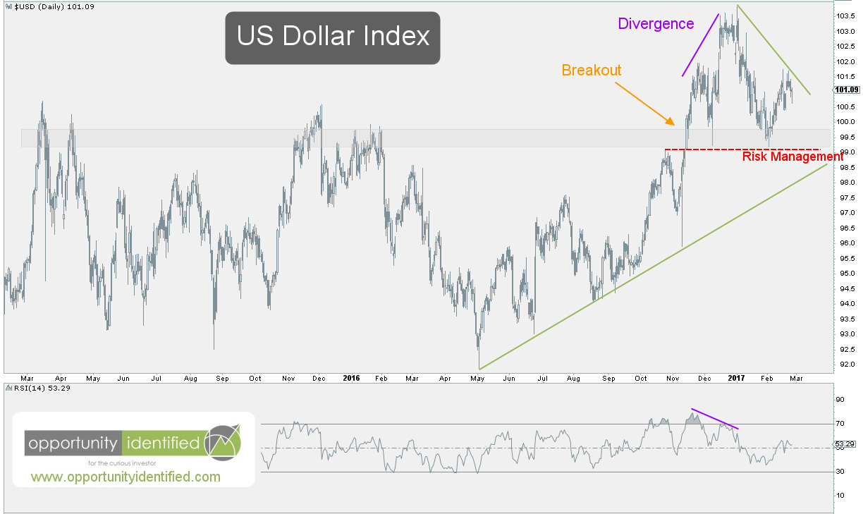
The power of using price charts is we can identify where demand and supply dynamics change and use these levels to manage risk, the most important part of being a market participant. We identified the $99-100 level as important support. Here’s the updated chart:

US Dollar Updated

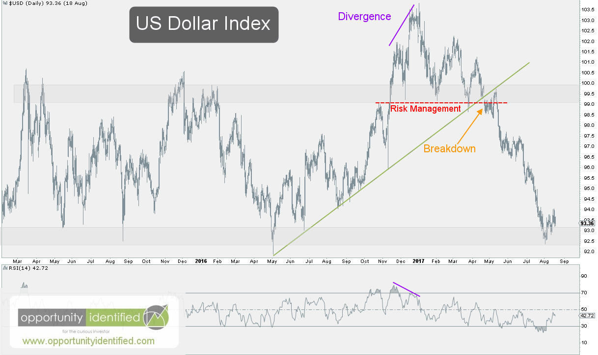
We can quickly see the Mighty Dollar broke down below the important $99-100 level, creating a false move. From false moves come fast moves in the opposite direction. As market participants, we didn’t need to predict the Dollar’s next move. We just need to have a game plan if buyers didn’t show up where they should have. They didn’t show up, opening up the window to the next possible level of logical demand from buyers. In our follow-up post from May, we wrote:

If the selling continues, we’d expect buyers to show up near the $92-93 handle

Six months after recognizing the potential for a false move, we’re at the $92-93 level in the U.S. Dollar. In fact, the U.S. Dollar has fallen over 10% since we identified potential selling pressure on the world’s reserve currency of choice. While the visual math of supply and demand for the Greenback pointed to potential demand issues, The Economist was busy regurgitating the popular narrative at the time:

Economist Cover - US Dollar

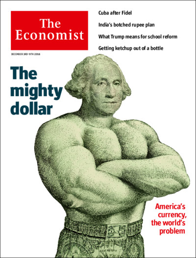
We can’t make investment decisions based on magazine covers. That would be as silly as trying to predict where the market will be by the end of the year. We’ll leave that for sell-side jockeys and magazine publishers. But we can use visual math (aka charts) to identify important support and demand levels for any liquid asset. Today, we’re in the $92-93 window identified back in May. Buyers have shown up to at this level many times over the past three years. Will they do so again? We have no idea. No one does (except maybe The Economist – sorry, couldn’t resist another jab). Our job as market participants is not to predict. Our job is to manage risk by identifying if/then scenarios to operate from. Here’s the visual:

US Dollar Bigger Picture

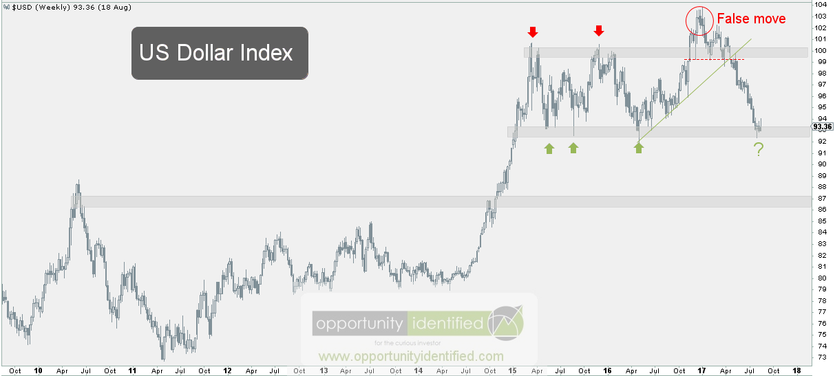
From this level, market participants have options. If you want to be long the US Dollar and think it can go higher from here, you could use $92 as your stop. Keep it simple. Above $92, own Dollars. Below $92, let someone else own Dollars. On the opposite side, if you want to be short Dollars, you can use $94 as your line in the sand. Above $94, you don’t want to be short the Mighty Dollar.

In conclusion, the $92-93 level for the U.S. Dollar is a pivotal one. Demand should show up here. If it doesn’t, we have our clue. Below $92, and selling pressure could take it down to the $86 level. Since many market pieces are priced in Dollars, this next directional move could have an impact across a variety of assets, including commodities and foreign equity markets. Trade accordingly.

As always, you can get real-time updates and commentary about this development and many more opportunities here: @360Research

AND, you’ve got FREE access to an investing tool we’ve created, The Ultimate ETF Cheat Sheet. Click this link to get your FREE easy-to-use resource guide for all your ETF needs.


Disclaimer: Nothing in this article should be construed as investment advice or a solicitation to buy or sell a security. You invest based on your own decisions. Everything in this post is meant for educational and entertainment purposes only. I or my affiliates may hold positions in securities mentioned in this blog. Please see our Disclosure page for full disclaimer.

Filed Under: Breakdown, Currency, False Move, Supply and Demand, U.S. Dollar Tagged With: $DXY, $USD, $USDJPY, $UUP, Greenback, US Dollar

April 10, 2017 | Posted by David Zarling, Head of Investment Research

This Is How The Relationship Between Lumber And Gold Will Impact Your Portfolio

0
0
0
0
0
0
0
0
0
0
0
0
0
0
0
0
0
0
0
0
0
0
0
0

Many investors tend to focus on asset-class specific study to gain an edge. They attempt to obtain outperformance based on factors directly related to the asset class being studied. This is an appropriate practice and can provide valuable insight. But in this post, similar to last week’s article on the relationship between Copper and Latin American equities, we’re going to look at the relationship between Lumber and Gold. Specifically, we’re going to follow-up on previous research showing the relationship between Lumber and Gold contain insights into risk-seeking and risk-averse behavior in stocks. The Lumber/Gold relationship is not a novel idea. This important connection was brought to the fore by Charlie Bilello and Michael Gayed in their 2015 NAAIM Wagner Award Winning Paper, “Lumber: Worth Its Weight In Gold.” Charlie and Michael are extremely smart asset managers with strong thought leadership when it comes to actively managing funds. We can’t hold their intellectual jocks, but we can use their research and look into the current state of Lumber and Gold to find another piece of evidence for managing risk in today’s market. In their research, they find:

As Lumber outperforms Gold, equities tend to exhibit an upward bias and have lower volatility. These are conditions that are conducive towards maintaining higher exposure to risk assets. As Gold outperforms Lumber, the opposite tends to be true, whereby the inclusion of lower beta assets in a portfolio increases overall return and lowers volatility at the time it is needed most. The relationship between Lumber and Gold helps to answer the most critical question for active asset managers: when to take more risk (“play offense”) and when to take less risk (“play defense”) in an investment portfolio – before it’s too late.

The relationship between Gold and Lumber can give us valuable insight into U.S. stock market volatility and risk. As market participants, we can use this relationship to give us an edge. Simply put, their findings highlight when Lumber is outperforming Gold, it is a risk-on (offensive) characteristic for stocks. In this scenario, investors can be more aggressive with their equity exposure. Oppositely, when Gold is outperforming Lumber, this is risk-off (defensive) behavior and investors should take a more protective stance. Accordingly, it makes sense for us to dig into how Lumber and Gold are performing and conclude with a review of their relative strength to each other.

Here’s the weekly chart of Gold:

Gold Weekly Chart

Gold remains in a downtrend from weekly perspective. Since 2011, everyone’s favorite precious metal has been making lower highs and lower lows, the very definition of a downtrend. That is, until recently. In early 2017, Gold locked in a higher lower. This was a productive step towards trend change. If it can break through the upper green trend line, we’ll have a break in trend momentum. A close above $1,375 would establish a higher high and a potential new uptrend underway. For now, it remains within compression (two converging trendlines). Out of this compression will come a move that most likely will determine Gold’s future in the weeks and months ahead.

As for Lumber, here’s its respective weekly chart:

Lumber Weekly Chart

Lumber broke out of a downtrend in early 2016. In fact, Lumber’s higher low in February 2016 coincided with a bottom in U.S. stocks. Never discount coincidence. Since then, Lumber has continued to establish higher highs and higher lows in price. Just last week, it broke from a month’s long consolidation to make an attempt at the early 2013 highs. A break above the $400 level would be extremely productive for Lumber overall.

Now, here’s what you’ve been waiting for. The weekly chart of Lumber : Gold. As a friendly reminder, when Lumber is outperforming Gold, the ratio rises. When Gold is outperforming Lumber, the ratio falls.

Lumber:Gold Weekly Chart

Even going back to 2011, we can see the ratio bottom in August of that same year. Do you know what also bottomed at the very same time? The S&P 500. The ratio broke out of a long-term downtrend in late 2012, which preceded the S&P 500 breaking to fresh all-time-highs in August 2013. Similarly, this important ratio broke down in late 2014, which preceded an S&P 500 breakdown in July 2015. More recently, we’ve seen Lumber outperform Gold and establish a higher low in February 2016 and breakout of an intermediate downtrend in November 2016. Since then, the ratio has been continuing its movement upwards signaling risk-on behavior in stocks and diminishing volatility overall. We’ve definitely seen stocks take off since then and volatility crushed with one of the calmest markets in history during this time frame. Just last week, as Lumber broke towards its 2013 highs, this ratio also broke out to a level not seen in eight years.

The next few weeks will be crucial for this relationship and the significance it carries for equities overall. Lumber needs to break through the $400 level in order to ratio to hold onto its recent breakout. If Lumber : Gold can hold onto these recent highs, it will likely mean further upside for equities (especially high beta equities) and suppression of volatility. On the flip side, if Lumber falters here while Gold continues to move upward, the ratio will roll over, signaling a need to take a defensive stance in your portfolio.

As always, you can get real-time updates and commentary about this development and many more opportunities here: @360Research

AND, you’ve got FREE access to an investing tool we’ve created, The Ultimate ETF Cheat Sheet. It’s an easy-to-use resource guide.


Disclaimer: Nothing in this article should be construed as investment advice or a solicitation to buy or sell a security. You invest based on your own decisions. Everything in this post is meant for educational and entertainment purposes only. I or my affiliates may hold positions in securities mentioned in this blog. Please see our Disclosure page for full disclaimer.

Filed Under: Breakdown, Commodity, Equity, Gold, Intermarket Analysis, Lumber, Market Outlook, Precious Metals, Ratio Analysis, Risk Management, S&P 500, Soft Commodity, Volatility Tagged With: $CUT, $GC_F, $GLD, $GOLD, $LS_F, $LUMBER, $SPX, $SPY, $WOOD

March 27, 2017 | Posted by David Zarling, Head of Investment Research

Pay Close Attention To These Important Levels On The S&P 500

0
0
0
0
0
0
0
0
0
0
0
0
0
0
0
0
0
0
0
0
0
0
0
0

Whether we like it or not, if we participate in markets, we’re in the risk management business. If we don’t have a plan for when we’re wrong, it’s a problem. And if we don’t think it’s possible to be wrong, it’s an even bigger problem. The market is about possibilities, not guarantees. Markets owe us absolutely nothing and are brutally efficient at making us pay for poor decisions. As you know, we like to look for evidence to support our investment decisions. The best piece of evidence is price. What is it doing? What’s its direction? If price is making higher highs and higher lows, the trend is up. If price is making lower highs and lower lows, the trend is down. By analyzing price itself, we can determine the general trend and the potential change thereof. How do we do this in reality? Simple. Just look left. When we analyze price using charts, we find the current price and look left. See the daily price chart of the S&P 500 below. Notice that price has been steadily making higher highs and higher lows. It is a beautiful staircase upwards, hallmarking an uptrending market. That is, until March 21st.

Daily Chart of S&P 500

On March 21st, many U.S. markets, including the S&P500, broke down from consolidation. Keep in mind, consolidations typically resolve in the direction of the primary trend. In this case, an upward resolution would have indicated a healthy market and an ongoing uptrend. When consolidations resolve in the opposite direction of the primary trend, we need to respect the weakness (aka supply) hitting the market. If there’s not enough demand to keep the S&P 500 ($SPX) above 2363, it’s significant. Not only did selling pressure push price below 2363, it also caused a break of the momentum trendline (in green) that’s been in place since early December 2016. Consequently, a lower high and lower low have been locked in. Lower highs and lower lows are the very definition of a downtrend.

What now? Buying urgency needs to pick up immediately to reclaim 2363 and reenter the sideways range established since the beginning of March. If buyers can’t accomplish this in short order, there is a very strong possibility for price discovery to take the S&P 500 down to an area of prior demand near 2277. A visit to the window of 2240-2277 would be a logical retest to see if buyers are serious there. It would equate to a 38.2-50%  retracement (for you Fibonacci aficionados out there) of the rally since the November 6, 2016, low. More important, we need to understand this would equate to a correction within a bigger picture uptrend in place since mid-2016. A -5-6% correction from the March 1st high would be extremely normal behavior for a market that just broke out of a 2.5-year consolidation back in July, 2016. Any pullback here should be viewed as an opportunity to buy back into a strong bull market. If and when we visit 2277, we’ll revisit this information and see if there is additional evidence to consider.

As always, you can get real-time updates and commentary about this development and many more opportunities here: @360Research

AND, you’ve got FREE access to an investing tool we’ve created, The Ultimate ETF Cheat Sheet. It’s an easy-to-use resource guide.


Disclaimer: Nothing in this article should be construed as investment advice or a solicitation to buy or sell a security. You invest based on your own decisions. Everything in this post is meant for educational and entertainment purposes only. I or my affiliates may hold positions in securities mentioned in this blog. Please see our Disclosure page for full disclaimer.

Filed Under: Breakdown, Equity, Market Outlook, Other, S&P 500, Supply and Demand, Trend Analysis Tagged With: $SPX, $SPY, Momentum Trend

February 27, 2017 | Posted by David Zarling, Head of Investment Research

3 Important Developments Ready To Impact Your Portfolio

0
0
0
0
0
0
0
0
0
0
0
0
0
0
0
0
0
0
0
0
0
0
0
0

While stocks across the globe are rising, three very important assets have been consolidating. The demand for U.S. (and many international) equities has been incredibly strong for the past 3.5 months. After all, more demand than supply means higher prices. It’s economic law, not opinion, that drives price movement. The media and President Trump can politicize market movements all they want, but the truth is the urgency of buyers surpasses that of sellers. Call it a “Trump Rally” and you’ve got a nice sounding, gimmicky headline that grabs mouse clicks and eyeballs. It’s fake news. Don’t fall for it. Focus on the visual math of price instead. Have you ever met a price chart that lied to you? Exactly. Me neither. Price doesn’t lie. We can rely on it to make investment decisions and manage risk. And right now, the charts (aka visual math) is identifying three significant consolidations taking place in three important assets. When these compressions resolve, it will have an intermarket impact for at least the next few months.

First, let’s start with Oil, the world’s most consumed, and possibly most important, commodity. The price of black gold reverberates throughout economies and markets (keep in mind that a market is not the same as the economy it’s involved with). Nonetheless, the price of oil is important for many people, industries, sectors, and economies across the globe. It makes sense to pay attention to it. Since February 2016, oil has rallied over 100%. It should be noted, however, that this rally took place after a -75% drop dating back to June 2014. Oil would need to rally another 100% from current levels just to get back to June 2014 prices. This factual perspective is a stark reminder that massive drawdowns and losses are an investor’s worst enemy.

Looking at a daily chart of Oil, it’s easy to see price consolidating and compressing above the very important $50 level. Buyers and sellers are battling for the next move. In fact, you can’t go very far online without finding someone referencing the record long positions by institutions and record short positions by commercial traders.

Oil Futures and COT info

More often than not, commercial traders seem correctly positioned. However, we don’t need to predict. We need to plan. A break upward out of this consolidation would start a race to $75. On the other hand, we want nothing to do with this underneath $50. The line in the price is clear. Above $50, it makes sense to own it. Below that, it can be someone else’s problem.

Oil Daily Chart

Another important development is the consolidation of the U.S. Dollar. Just like Oil, the US Dollar broke out above previous resistance in the 4th quarter of 2016. On the daily chart of the U.S. Dollar, we’re compressing between $99 and $101. A break above the upper green trendline would signify a resumption of the uptrend started in 2014. And if price moves below $100, there is no reason to own the greenback. If the Dollar moves down through this important level, we could have a false move on our hands, with selling pressure picking up and providing a major tailwind to the aforementioned important asset, Oil. At the same time, keep in mind that Oil and the Dollar can continue to appreciate together as they’ve been doing since early 2016. Each chart must stand on its’s own merit. 

US Dollar Daily Chart

Finally, this trifecta of fun is concluded with a look at the 10-year Treasury Yield. The increase in yields from July, 2016, through the end of the same year was impressive to say the least. However, we need to remember the bigger context. We still remain in a 35-year downtrend in rates. That being said, resolution out of the consolidation annotated in the chart below will determine the next few months of direction for this important bond barometer. Note that the movements in rates have rhymed with the movements in the dollar. It’s likely that both resolve in the same direction. As mentioned before, each chart must stand on it’s own. With record short positions against 10-Year Treasury Bonds, we think the move out of this compression will be violent.

10-Year Yield Daily Chart

In conclusion, each of the three aforementioned assets are on the verge of picking a direction, up or down, that will have a major impact for the next few months ahead. Keep an eye on these consolidations for evidence to help you get on the right side of the trade. After all, if we’re in the markets to make money, it’s not about being right or wrong. It’s about being on the right side of the trade.

As always, you can get free real-time updates and commentary about this opportunity and many more here: @360Research


Disclaimer: Nothing in this article should be construed as investment advice or a solicitation to buy or sell a security. You invest based on your own decisions.

Filed Under: Bonds, Breakdown, Breakout, Commodity, Currency, False Move, Oil, Pattern Recognition, Supply and Demand, U.S. Dollar, U.S. Government Tagged With: $CL_F, $TNX, $USD, $WTIC, 10-Year Yield, Bonds, Commitment of Traders, Consolidation, COT, Oil Futures, TLT

June 10, 2016 | Posted by David Zarling, Head of Investment Research

Deutsche Bank Is Rock Solid?

0
1
0
1
0
0
0
0
0
0
0
0
0
0
0
0
0
0
0
0
0
0
0
0

Whenever a major financial institution feels the need to send correspondence to its employees, informing them their “bank is strong and its financial reserves are adequate,” investors should become alarmed. And when the same institution encourages employees to inform clients the bank is “absolutely rock-solid”, an investor’s BS meter should be blaring over 100 decibels (dB). Such was the case back on February 9, 2016, when co-CEO of Deutsche Bank (DB), John Cryan, sent those exact words to his employees. When we learned about this back on February 9th, our dB level about DB went off the charts. We’ve seen this before. Let’s take a look and see if Deutsche Bank is “rock solid.”

As you know, price is the final arbiter of value. Price is fact. When we study price, we are studying facts. When we study the stock price of Deutsche Bank, we should be able to draw a conclusion on whether or not this bank is “rock solid.”

Here’s the weekly chart dating back to 1997.

Deutsche Bank Weekly Chart

DB is down 87% since its all-time-high back in 2007 before the great financial crisis (GFC) engrained itself in the investor psyche. At all-time-lows, we would want to see some type of evidence from price that DB is “rock solid.” However, to the contrary, here is the daily chart.

Deutsche Bank Daily Chart

Deutsche Bank (DB) has broken down from a triangle pattern, which implicates a continuation of its 9 year downtrend. This breakdown is problematic as it targets a stock price for DB in the single digits. In addition, it’s self-evident this price action contradicts the bank’s claims. If anything, its stock price appears to be tied to a solid rock thrown overboard. From a global perspective, we hope this is a false breakdown and DB quickly recovers the $20 level. Because if DB is going to single digits (or worse), we don’t see how the global economy can avoid the counterparty consequences of their €41 Trillion in derivatives.

In conclusion, we hope we’re wrong and that price moves back above $20, proving that Deutsche Bank is not yet in trouble.  Otherwise, the consequences of further price decline of this company would mean the exact opposite of “rock solid” for their bank, and for global markets.

Get updates about this development and additional market commentary here: @360Research


Disclaimer: Nothing in this article should be construed as investment advice or a solicitation to buy or sell a security. You invest based on your own decisions.


Filed Under: Breakdown, Equity, Supply and Demand, Trend Analysis Tagged With: DB, Deutsche Bank

  • 1
  • 2
  • Next Page »

Find Out Our Top 10 Questions to Ask Your Financial Adivsor!

Subscribe to our mailing list today. No spam - we promise!

* indicates required
Tweets by @@360Research

Recent Posts

  • How To Get Involved In The Drug Trade (It’s Not What You Think!)
  • Invaluable Market Signal From The Value Line Geometric Index
  • This Is How To Navigate Amazon
  • Get Intel Inside Your Portfolio
  • Simple Market Secret: Just Look Left

Tags

$DBO $ES_F $INDU $SH $SPX $SPXA200 $SPY $TNX $USD $USO $UUP $VIX $WTIC $XLP $XLV Ascending Triangle Bonds Bottom breakout Confluence Consolidation Cycles demand descending triagle divergence Dow Jones Energy measured move Price Resistance risk/reward risk management RSX Russia RUT S&P 500 S&P500 SPY Supply TLT Trend Change trendline US Dollar Volatility weight of evidence

Copyright 360 Investment Research, LLC - All rights reserved © 2023