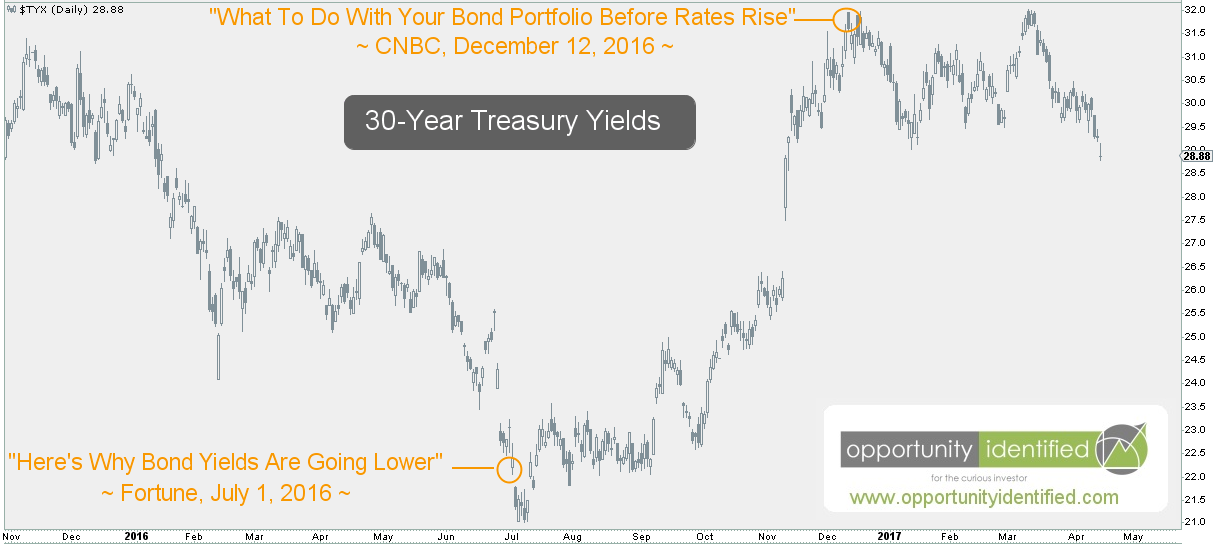
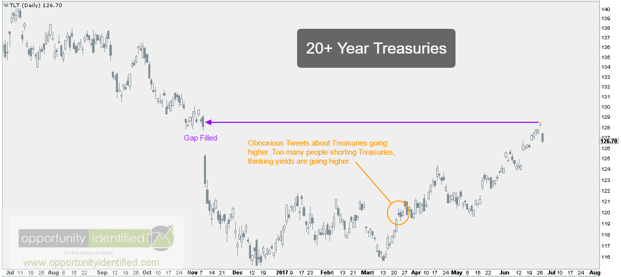
Back in mid-April, we posted about Why You Should Be Long The Long Bond. Back then, we noted the extreme pessimism regarding US Treasuries (aka Long Bonds) due to skewed short positions and anecdotal evidence that too many were confident yields would go higher. This long bond pessimism, and more importantly, the price action of Long Duration Treasuries (ticker: TLT), had us more than just liking long bonds. In fact, we became rather obnoxious about them on Twitter:


A little over 2 months and +7% later, and we’re back writing about long bonds. Why? Not because we love bonds so much. Rather, if you’ve been long the long bond since our Tweets and subsequent post, we think it might be time to take some of those gains off the table. In our April post, we wrote:
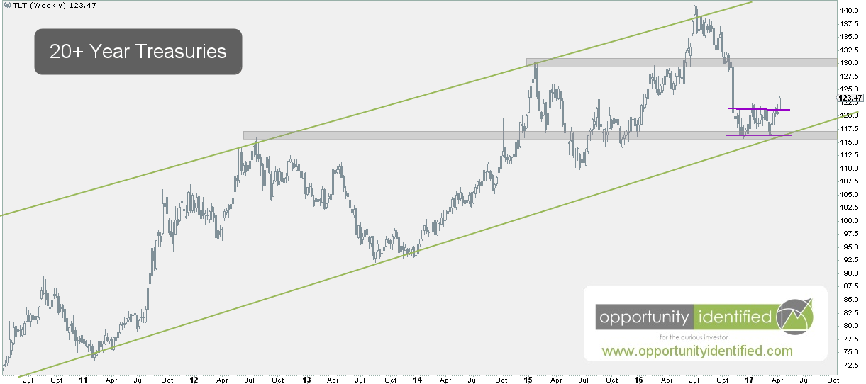
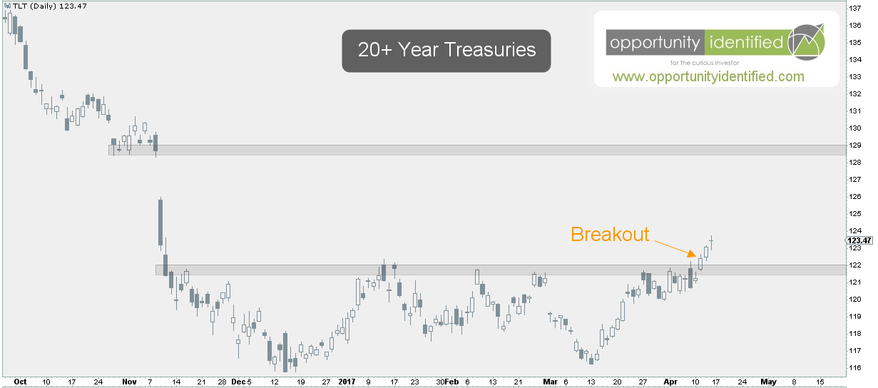
The longer demand pushes and holds TLT above 122, the more likely we revisit the gap breakdown near 129.
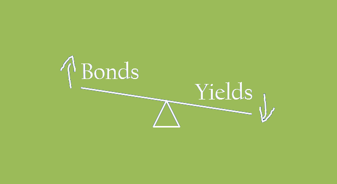
Yesterday, TLT quickly reacted to the high of 128.57. Close enough fro us. There is a reason for using price targets. These measured moves define our potential reward when determining whether a trade opportunity exists. What’s our risk? What’s our reward? The answer to these questions will determine whether or not it makes sense to enter a new position. After all, everyone should have an exit plan prior to entering a trade. That’s sound risk management and our number one priority as market participants. Yesterday, the ETF for Long Duration Treasuries (ticker: TLT), hit our upside target. Not only that, but we have this important new development: Last week alone, TLT received more inflows than all domestic equity mutual funds, and all domestic equity ETFs combined year-to-date [1]. Think about that for a moment. In only one week, TLT exceeded the total incoming purchases of all domestic equity mutual funds and ETFs made in the past 6 months! Talk about a sentiment shift. Everybody and their grandma is now piled into Long Duration Treasuries. Sounds like a crowded trade to us. Large crowds make for small exits. Can Treasuries move higher from here? Absolutely. However, without price sustaining 129 (and above) on TLT, we would be very skeptical of any further upside in this move. Keep in mind, this move from March until now is countertrend in nature. Price is above a falling 200-day simple moving average. A falling 200-day simple moving average is a hallmark of downtrends. As a friendly reminder, bonds and yields have an inverse relationship.
And if long bonds are reversing here, it means higher yields are on their way. And if higher yields are on their way, it will include ramifications for some other important sectors [cough *Financials* cough], which we’ll cover in another post. For the time being, TLT needs to regain 129, or at a minimum, stay above 124 to ruin our “higher yields from here” thesis.
In conclusion, with TLT reaching our price objective in a countertrend trade and inflows reaching extreme levels, we think it makes sense to take some off the table here. What applies to us may not apply to you. Trade safe.
As always, you can get real-time updates and commentary about this development and many more opportunities here: @360Research
By the way, we created this free tool for you, The Ultimate ETF Cheat Sheet. It’s an easy-to-use ETF resource guide. We think you’ll like it.
[1] Source
Disclaimer: Nothing in this article should be construed as investment advice or a solicitation to buy or sell a security. You invest based on your own decisions. Everything in this post is meant for educational and entertainment purposes only. I or my affiliates may hold positions in securities mentioned in this blog. Please see our Disclosure page for full disclaimer.